
After Amazon's earnings report, $Amazon(AMZN.US)'s stock price retreated, and its implied volatility also dropped to a new low for the year. From the two-year volatility trend chart in the top-left graph, it can be seen that during the stock price's pullback from the high, the implied volatility gradually rose from the bottom, showing a relatively healthy negative correlation.
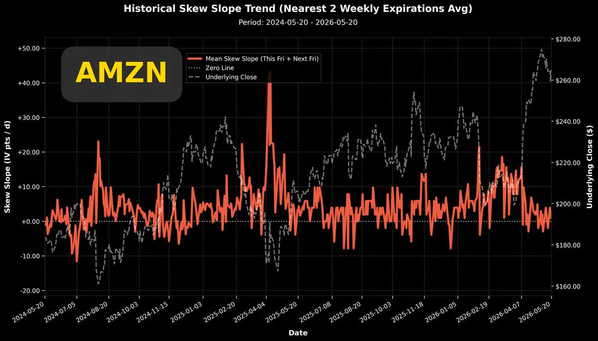
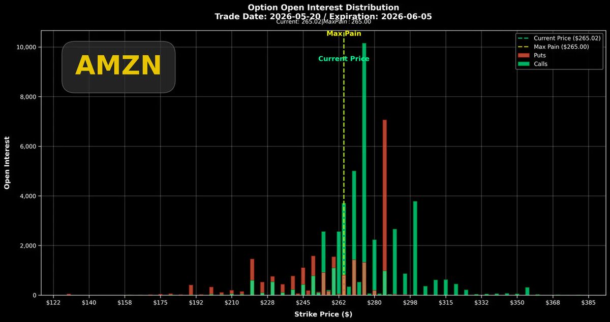
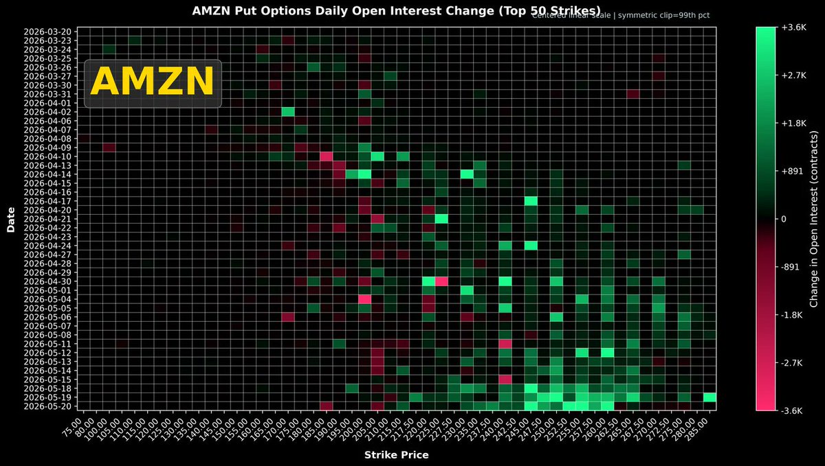
The top-right graph shows the two-year trend of the Put/Call volatility difference. The current difference is above the zero line, which is also the baseline value for the past two years.In this volatility difference chart, three dates are worth noting: 2024/08/15, 2025/04/04, and 2026/03/05.Around these three dates, you can see the brick-red lines all show a raised head pattern, which corresponds to the local lows of the stock price. $Amazon(AMZN.US) has this commonality: when the put volatility is significantly higher than the call volatility and persists for a period, it often indicates a local low in the stock price.The bottom-right graph shows options expiring within the next month. The maximum pain point price has caught up with the stock price, making the recent $Amazon(AMZN.US) pullback worthwhile. The maximum pain point price catching up with the stock price helps initiate a new round of upward movement.In the position accumulation chart, I found that for options expiring on 06/05, there is an in-the-money put option with a size of about 7,000 contracts, with a strike price likely at $285.I checked that the previous high of the stock price was only $278.5. In other words, these 7,000 contracts were in-the-money puts when initially established. The liquidity of in-the-money options is slightly worse, and with a size of 7,000 contracts, this operation is very unusual and extremely rare.Of course, buying in-the-money puts can be interpreted superficially as a short position with lower leverage. Since the initial strike price is set in-the-money, the probability of the position expiring worthless due to unfavorable price movement is less than 50%. It's a slightly more conservative shorting operation.The above view assumes that these 7,000 contracts were primarily formed by buyers.Let's look at the bottom-right graph again. This heat map shows the daily position changes for put options recently.If we focus on the $285 strike price (the far-left edge of the chart) and track from late March to today, there were only two days with significant put option accumulation: 05/08 and 05/19, with the accumulation on 05/19 being particularly intense (thousands of contracts).05/19 happened to be the worst trading day forming the recent stock price low ($255). I speculate that during trading on that day, traders or trading algorithms saw signs of further accelerated decline in the stock price, so they positioned in-the-money puts for a lower-leverage short.The above are all my speculations based on stock price and options trading data. Whether buying or selling, having such liquidity (without disturbing implied volatility) actually indicates that the forces on both sides are not significantly different.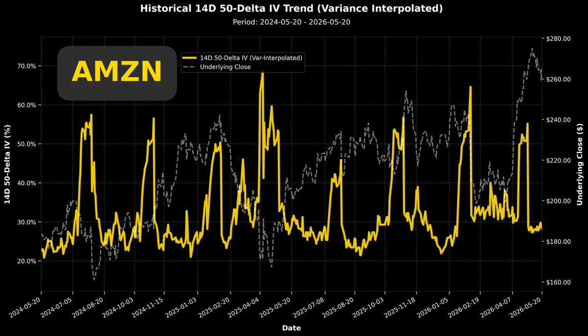
The copyright of this article belongs to the original author/organization.
The views expressed herein are solely those of the author and do not reflect the stance of the platform. The content is intended for investment reference purposes only and shall not be considered as investment advice. Please contact us if you have any questions or suggestions regarding the content services provided by the platform.