I bought the MacBook a little over a month ago, and this morning I used its built-in speakers to play music for the first time. Wow! Is this really a laptop? The sound quality is simply on par with a bedside speaker. How did they manage that? Producing such a speaker-like effect in such a thin chassis.

CurryOption
CurryOptionSuggestions for you to follow
C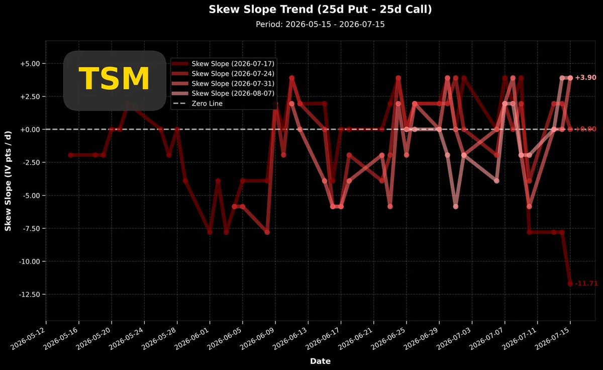
I originally thought TSMC ($Taiwan Semiconductor(TSM.US)) could be as reassuring as in the past, so I haven't looked at TSMC for quite a while, even on the eve of the earnings report.........
But the chart below shows the volatility spread difference on the eve of the earnings report. I just praised TSMC last week for not showing signs of long-side overheating before the report.However, looking at the chart now, I suddenly realized that the long side has been frantically betting on call options in the last three trading days.In the past few times when TSMC showed this situation, it didn't necessarily point to a stock price decline. Even though, as a general rule, excessive long-side accumulation is almost a standard precursor to a 'sell the news' scenario after the report.When TSMC's volatility spread difference reached deep negative values in the past, it didn't point to a stock price decline.But this time seems different. Returning to the general trading rule, $Taiwan Semiconductor(TSM.US) is currently down 4.2% in pre-market trading.C
I've found a better way to work: I only use "5.6 sol ultra-high reasoning" during the planning phase, and use "5.6 Terra ultra-high reasoning" for regular work. Discuss and outline the architecture and workflow with 5.6 sol, and save the discussion results directly as a markdown file. Then, open 5.6 terra and ask it to follow that markdown to complete the specific coding and testing tasks. If it's a long-term development project, you don't really need to set the speed to 1.5x acceleration. Because even with 1.5x acceleration, even 5.6 terra will use up its 5-hour quota. If it runs out, and you don't immediately pull out a magic little card to pay for more quota, but just sit there waiting, it's pointless. Instead, it's better to set it to normal speed and let 5.6 Terra output steadily and consistently. After using it continuously for over 24 hours, I'm very sure that with ultra-high reasoning enabled, 5.6 Terra's performance is significantly better than the previous generation chatGPT 5.5. As for the previous generation GPT 5.5, I honestly don't think it has any issues for work anymore; frankly, it's already sufficient. The main significance of 5.6 for me is during research and discussions; it's a more intelligent collaborator, and its spoken Chinese expression has also improved somewhat. In purely scientific discussions, it's a more reliable partner than 5.5.
C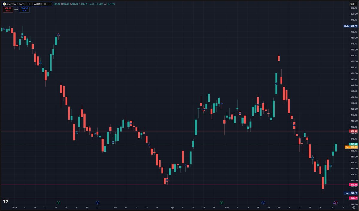
I just noticed by chance that Microsoft had officially fallen below $356. It's currently rebounding. If it can break through $401 in the next few days and return to the earlier boxed oscillation range from mid-April to the end of May, it will be relatively safer. The worst fear is that it just touches $401 and falls back down. If this pattern emerges, I think it will be even harder to hold the $356 level on the next drop. Enough talk, I need to quickly check the $Microsoft(MSFT.US) options data. I'll post an analysis article in forty minutes.
C
It's been a long time since I wrote about the "Options Talk" series. Today, I came up with a topic. I haven't started researching it yet, but I'll share my thoughts with you first. Perhaps before I start, the feedback from everyone can help me complete a more exciting mini-research project.
〖Is the implied volatility of options with 14 days to expiration consistent with the actual stock price volatility that occurs in the following 14 days? Underestimated? Overestimated?〗
People who participate in options trading have a preconceived notion in their minds about the distribution of stock prices 14 days later. This notion determines how they judge the price of that option.
If an options participant believes that stock price volatility will be high, and there is a high probability of breaking through the strike price in 14 days, then they are willing to accept a high market price for the option.
If an options participant believes that stock price volatility will be low, and the probability of the stock price breaking through the strike price in 14 days is very low, multiplying the small probability value by the breakthrough price results in a very small value, then they will price the option at a very low price.
Options traders' judgments about prices often contain an emotional premium. This leads to the actual future 14-day stock price volatility perhaps always being lower than the implied volatility. The portion where "implied volatility" is higher than "actual future 14-day stock price volatility," the excess part, is the emotional premium that investors themselves assign.
What is this premium? Is it positive or negative?
Which stocks have particularly high emotional premiums? Which ones are particularly low?
When are emotional premiums particularly high? When are they particularly low?
#Volatility Risk Premium (VRP)
C
 +1
+1
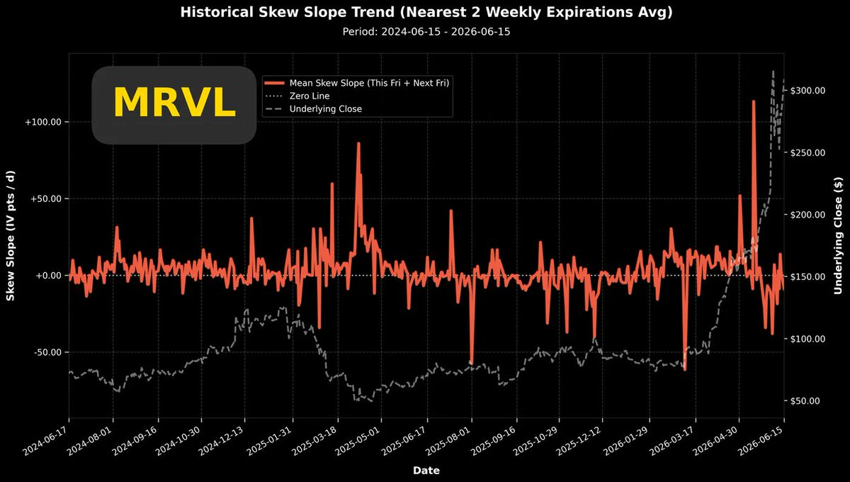
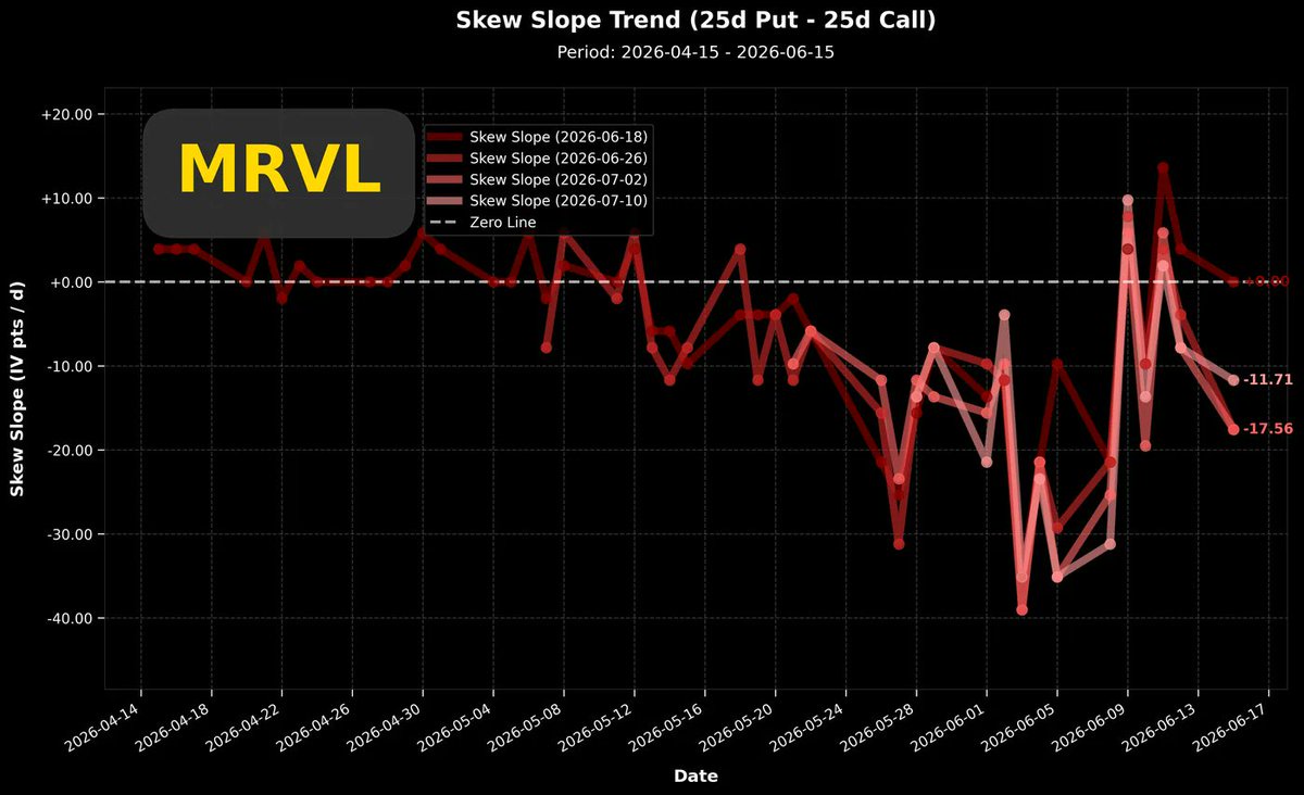
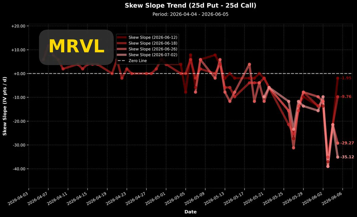
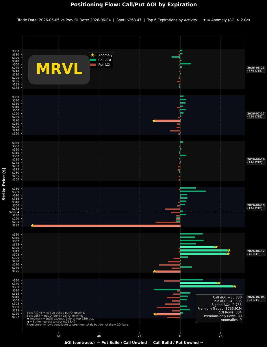
$Marvell Tech(MRVL.US) recently had a piece of negative news that I believe will have no substantial impact. On 06/11, the company announced a CFO transition: the current CFO Willem Meintjes will step down. The latest update on 06/15: Meintjes filed Form 144, planning to sell approximately 207,000 shares (nearly 48% of his holdings), amounting to about $60.1M.
Compared to $Marvell Tech(MRVL.US)'s daily trading volume of tens of millions of shares, 200,000 shares are truly insignificant, and I believe it will not affect the stock price at all.The top-left chart shows the two-year implied volatility trend. After the last earnings report, volatility returned to the baseline, with only a very brief dip before immediately rising back near the earnings peak. However, it cannot be said that it did not fall back to the baseline, because since last December, the volatility baseline has risen significantly, especially after mid-March, the baseline seems to have risen parabolically along with the stock price.Perhaps the current volatility has already returned to the baseline, but the baseline itself has now risen to a height of 100%.The top-right chart shows the two-year Put/Call volatility skew. Before the most recent earnings report, there was also a trend of active bullish bets. Although after the earnings report, the volatility skew oscillated with the high stock price and has returned near the zero line, and the bullish momentum has largely dissipated.Looking at the bottom-left chart, this is the short-term Put/Call volatility skew trend. From the active bullish bets in early June, it once turned back to buying put options due to the sharp stock price drop. Now it is gradually tilting back towards call options.The bottom-right chart is the options open interest change chart. Recently, there have been over 20,000 new call options, and slightly further out (dte=67 days), there have also been 3,000 new in-the-money call options. These new options are mainly buy-side, indicating active bullish sentiment among market participants.Summary: Volatility remains on a steeply rising parabolic trajectory, and market participants' bullish stance is evident. In such a trading environment, I would not be surprised if a sudden surge occurs later.+1
C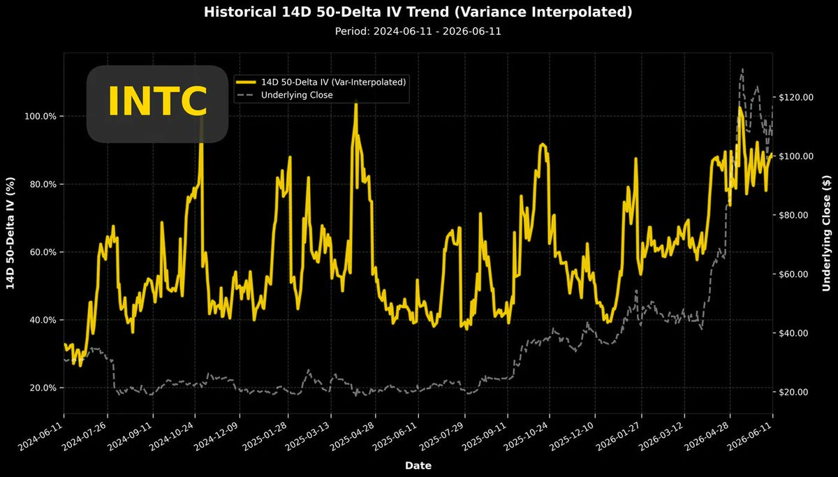
 +1
+1
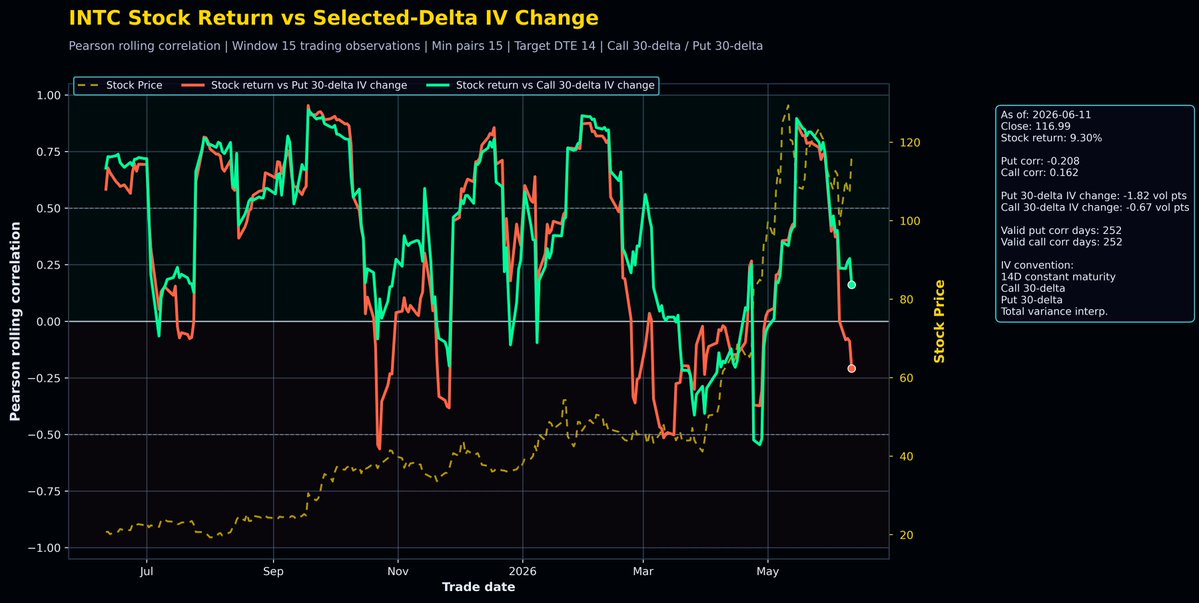
$Intel(INTC.US) taught me an important lesson this year.
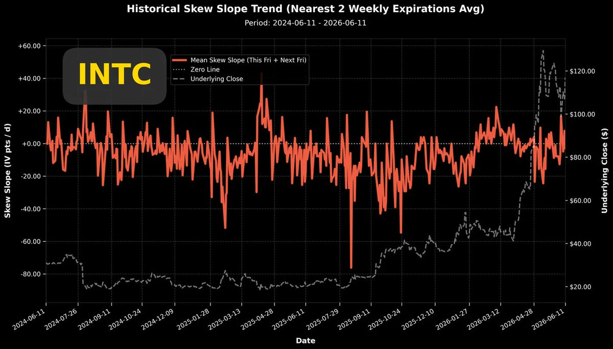
After $Intel(INTC.US)'s earnings report in January, the implied volatility did not drop back to its previous benchmark (~40%). At the time, I didn't fully understand it and only warned in my analysis article that trading activity remained high. This unusual behavior caught my attention, but I couldn't just imagine that the stock price would surge significantly afterwards.After the January earnings, the implied volatility has been oscillating at a significantly higher new plateau. This persisted for over a month, during which the stock price remained in a sideways consolidation. As you all know, what happened later was the stock price surged sharply from around $50 to touch $120.The most recent earnings were on 04/23. After this earnings report, the volatility simply did not decline; there was hardly any benchmark value anymore. The volatility after the 04/23 earnings has been oscillating near the peak level from the report.Therefore, do not short it! I would even suggest that if you have a large position in the underlying stock and you have the itch to sell covered calls, it's certainly possible, given the abnormally high volatility. However, keep the size of your sold position small and, taking advantage of the high volatility, try to sell short-term, deep out-of-the-money options.The current observation is that $Intel(INTC.US)'s stock performance has been quite good over the past week, but the oscillation of volatility remains within a normal range, which is a good thing.The top-right chart shows the Put/Call volatility skew over the past two years. This chart reveals that $Intel(INTC.US)'s volatility skew has often stayed below the zero line over the past two years; this is its fundamental characteristic. Therefore, unless the volatility skew drops below -20, we should not consider it "long crowding," as historical data from the past two years shows that $Intel(INTC.US)'s participants just like to crowd in and join the excitement.The current volatility skew is even in a relatively conservative state, hovering near the zero line.The bottom-left chart is an analysis of the correlation coefficient between stock price returns and volatility. This chart made my eyes pop!Since May, $Intel(INTC.US)'s stock price has been consolidating at high levels, once briefly dipping below $100. Yet, just this level of price correction has already pushed the correlation coefficient downward, with the red line (Put) falling even lower. Even with the significant rise in $Intel(INTC.US)'s stock price over the past week, the correlation coefficient hasn't immediately rebounded to its previous highs. If this week's trading pushes $Intel(INTC.US)'s correlation coefficient further down to touch -0.5, it will complete a very healthy price consolidation pattern. This is quite remarkable: with limited price decline, managing to cool down or even reverse trading sentiment. Once such a pattern is completed, it sets the stage for the next potential price increase.The bottom-right chart shows the intraday options position change chart. Call option building has been more active. Moreover, due to $Intel(INTC.US)'s inherent stock characteristic of having a tendency for chasing and buying calls, a certain level of new call option positions is maintained even without specific news.Summary: $Intel(INTC.US) is close to completing a high-level consolidation where price decline is limited, but trading sentiment is reversing. Whether it completes will be revealed in this week's trading. Once $Intel(INTC.US)'s stock price completes its consolidation at high levels, it creates favorable conditions for the next upward move.+1C
 +1
+1
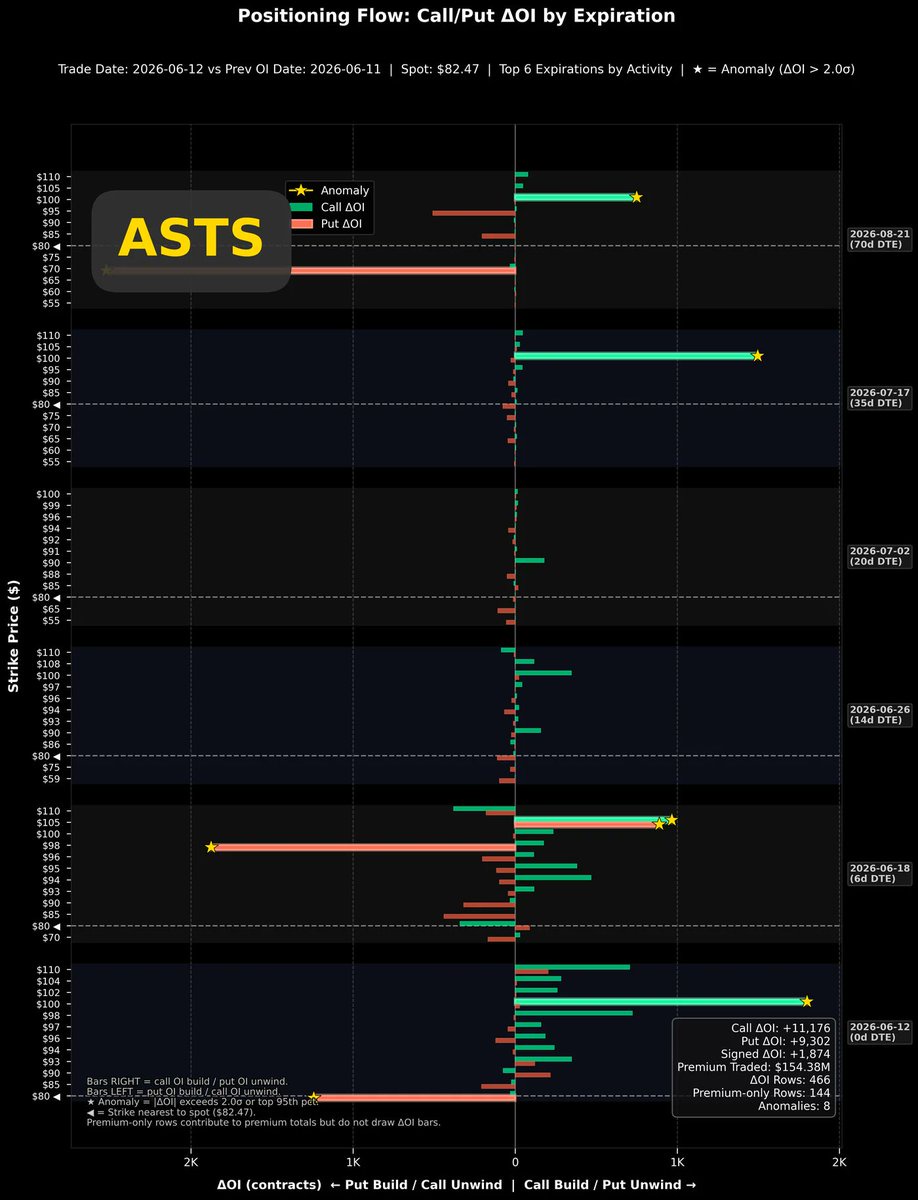
$AST SpaceMobile(ASTS.US) Since the Blue Origin rocket explosion, stocks in the space industry have been acting strangely. $AST SpaceMobile(ASTS.US) stock price has been highly volatile, and in the short term, it's also been affected by the SpaceX (SPCX) IPO, showing a clear phenomenon of "fund rotation + sell the news." Last Friday, the stock price fell 15.53%, and the current price is $82.41.
The most clear positive catalyst recently is that AST SpaceMobile has confirmed that BlueBird 8, 9, and 10 will be launched on a SpaceX Falcon 9 from Cape Canaveral on June 17.
But whether a company can operate well isn't solely about technological strength.
The top-left chart shows the implied volatility over the past two years. In this chart, we can clearly see the significantly declined stock price while volatility remains high. This is a relatively positive aspect I see in today's data, but how positive this is must be judged with the help of the Put/Call volatility spread.
The top-right chart shows the recent trend of the volatility spread. This chart looks quite unfavorable because, despite such a large drop in stock price, the main trading pattern is still chasing to buy call options. The volatility spread has been in a deeply negative state most of the time. Very few market participants are buying Puts to hedge against the price drop; everyone is still in the fervent speculative atmosphere of buying on every dip.
For the stock price to rise sharply, it naturally needs speculative frenzy to boost it. However, during the process of price correction and consolidation, if it doesn't trigger panic and spur a frenzy of chasing to buy put options, it's very unfavorable for the price correction and consolidation. In plain terms: the deleveraging of the long positions hasn't been completed yet.
Looking at the bottom-right chart, the correlation coefficient analysis between stock return and volatility, as expected, the current correlation coefficient still maintains a significantly positive correlation. The stock price has fallen so much, but compared to February and April this year, we cannot determine that the price correction is complete based on the existing data.
The bottom-left chart is the option position change chart from last Friday's trading. There is still a more noticeable increase in call option positions, but put option positions have also started to increase, which is a good sign. I think the stock price shouldn't rush to rebound subsequently. It would be a better state if it could consolidate weakly and let the bullish trading sentiment cool down.
Summary: The stock price has already fallen so much, but the analysis data surprisingly suggests "it hasn't fallen enough yet."
+1C
I'm on a flight back to Taiwan.
On the way there, I had to drive as soon as I landed, so I didn't drink at all. On the way back, I'm taking a car to Hsinchu, so I'm drinking freely on the plane with peace of mind.
I'm feeling quite relaxed, after all, I've completed a mission, taking my parents on a big loop around the northernmost part of Japan's main island all by myself.
We are so dedicated to trading and investing because of love.
We hope to reach a state where we live in complete freedom. If you understand yourself deeply enough, you'll probably find that you don't want to make money because you love money. Fundamentally, you want to make money because you love yourself. Making money is just a means, not an end.
You want to avoid grievances, you want to live the way you desire, so you yearn to earn enough money.
You, we, make money because of love.
At the same time, we hope our family can also enter this state. We hope the people we love can also live as they like.
So, we invest our efforts, we dare to endure.
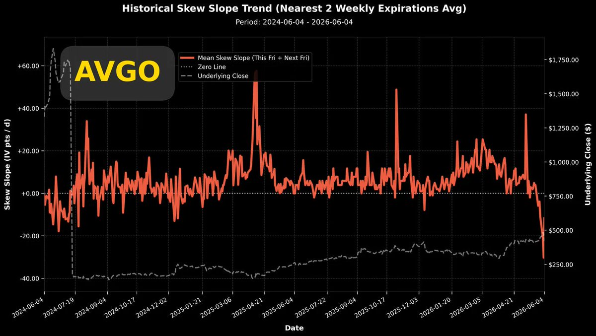
First $Broadcom(AVGO.US) then $Oracle(ORCL.US), this wave of pullback probably won't end early.
All things that are particularly meaningful are never easy. I understand your difficulties, and I'm certain these difficulties will accompany us for life.
But, it's okay, because with love, whether it's love for ourselves or love for our family, we can withstand disappointment after disappointment.
By the time you read this message, I'll already be back in Taiwan. I've returned to the team, let's fight side by side again!
C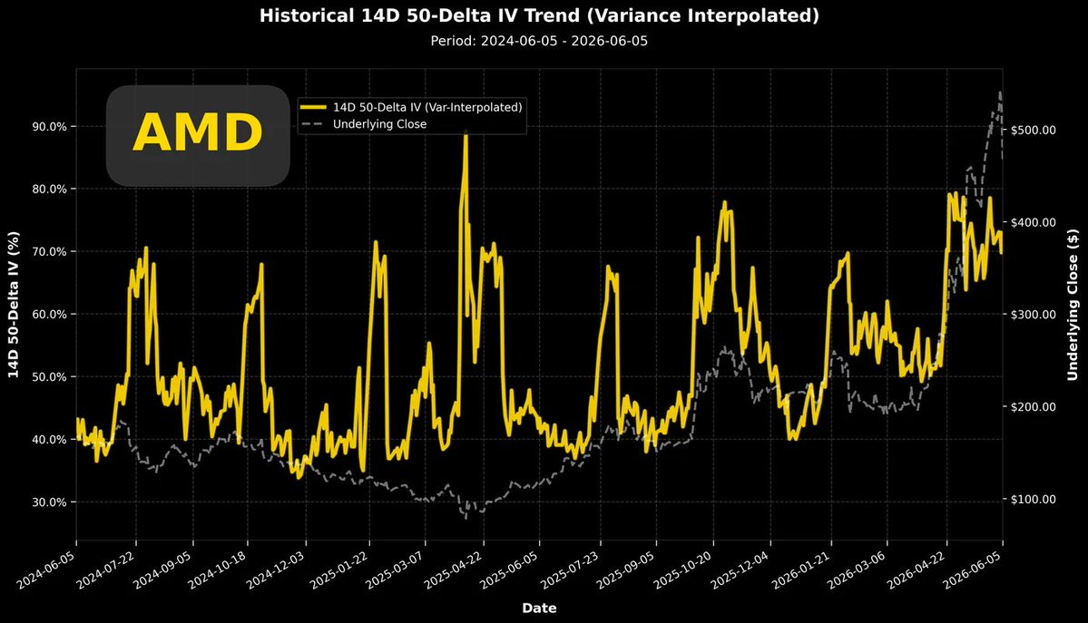
 +1
+1
$AMD(AMD.US) (Advanced Micro Devices) suddenly dropped 10.86% last Friday. Does such a significant single-day decline create any particular pattern in the options trading data?
I'll state the conclusion first: the existing structure remains unchanged.
The top-left chart shows the two-year overall implied volatility. This chart indicates that after the last earnings report, the baseline level of implied volatility was elevated by one notch and did not fall back to the pre-earnings baseline. Post-earnings, the trading sentiment entered a new atmosphere (or narrative).
Following last Friday's sharp decline, the current volatility level is still fluctuating within the range of the new baseline.
The top-right chart shows the recent Put/Call volatility spread. After last Friday's drop, the volatility spread jumped upwards, but the magnitude of the jump is not large and remains within the typical fluctuation range.
After Friday's decline, neither the volatility level nor the volatility spread has shown a new pattern. It seems the current stock price movement is still considered a 'normal energy release' for $AMD(AMD.US) by market participants.
The bottom-left chart shows the single-day position change. It reveals some long positions closing out, but more notably, put options were opened across a wide range of strike prices. These trades aren't clearly about who is exiting or entering, as under these general position changes, the volatility spread change is minimal, only shifting slightly towards puts, with no clear directional bias emerging.
The bottom-right chart shows the correlation coefficient between stock price returns and volatility. Last Friday's drop also caused the correlation coefficient to fall from a positive correlation above 0.5. It would be more reassuring if it could touch zero, because after May, there was a local stock price low point, which was accompanied by the correlation coefficient briefly touching zero. If it doesn't even touch zero, it doesn't resemble a complete stock price pullback pattern.
Summary: While $AMD(AMD.US)'s stock price is pulling back, volatility hasn't changed much. Position changes show increased buying interest in puts and some call options being closed out, but these are not significant. The structure presented by the options trading data remains the same as before the sharp price drop. According to correlation analysis, it is indeed in a consolidation phase of the price pullback. If the subsequent correlation coefficient can drop to negative or at least touch zero, then we can start watching for the potential emergence of a local bottom in the stock price.
+1C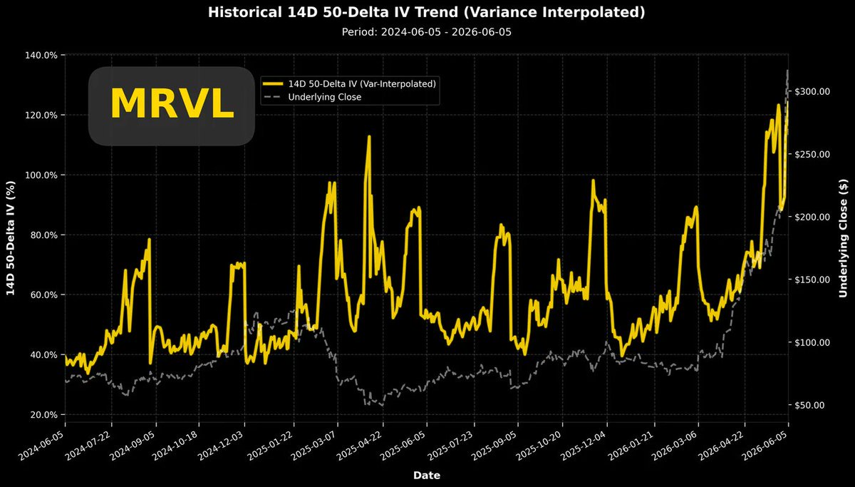
 +1
+1
$Marvell Tech(MRVL.US)'s stock price surged after 06/02. Although it experienced a significant pullback in the most recent trading day, volatility remains at historically high levels. The current short-term volatility exceeds 120%, which is sure to attract many options traders to sell options.
The top-right chart shows the recent trend of the Put/Call volatility spread. In this chart, we can see that with the sharp drop in stock price on the most recent trading day, the trend of the volatility spread has diverged. Options expiring soon have sharply rebounded towards positive values. The defensive stance of short-term put options is obvious. Interestingly, options expiring in three weeks and one month are trending towards negative values, meaning that options expiring after three weeks are still predominantly bullish.Market participants in $Marvell Tech(MRVL.US) believe the recent stock price decline is due to external factors, and these so-called external factors are expected to be corrected and covered within two to three weeks.The bottom-left chart shows the intraday changes in options positions. The most noticeable is the significant increase in new put option positions for options expiring on 06/18, while for other expiration dates, bullish and bearish positions are roughly balanced.The bottom-right chart shows the daily change in call option positions since early April. The large wave of call option opening initiated on 05/27 has not subsided, maintaining a white-hot scale of position building every day.In summary: Even though the stock price fell, volatility still managed to reach new highs. Furthermore, the volatility spread clearly shows a divergence between short-term and medium-to-long-term options. I personally maintain a relatively optimistic view on $Marvell Tech(MRVL.US)'s stock price.+1C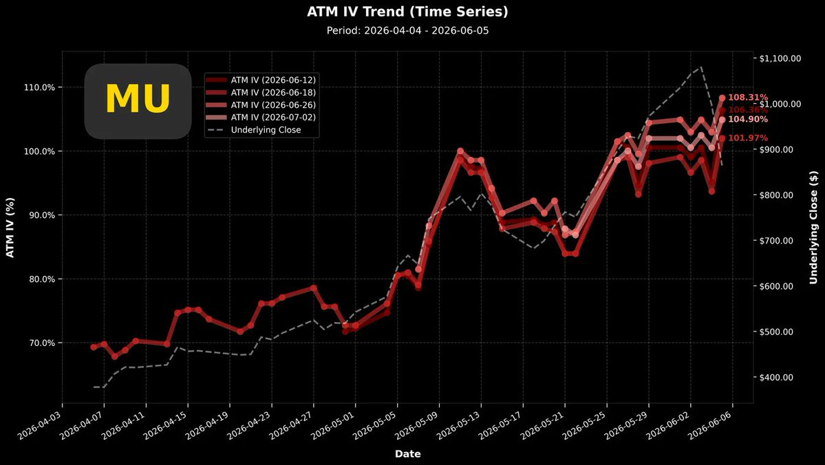
 +1
+1
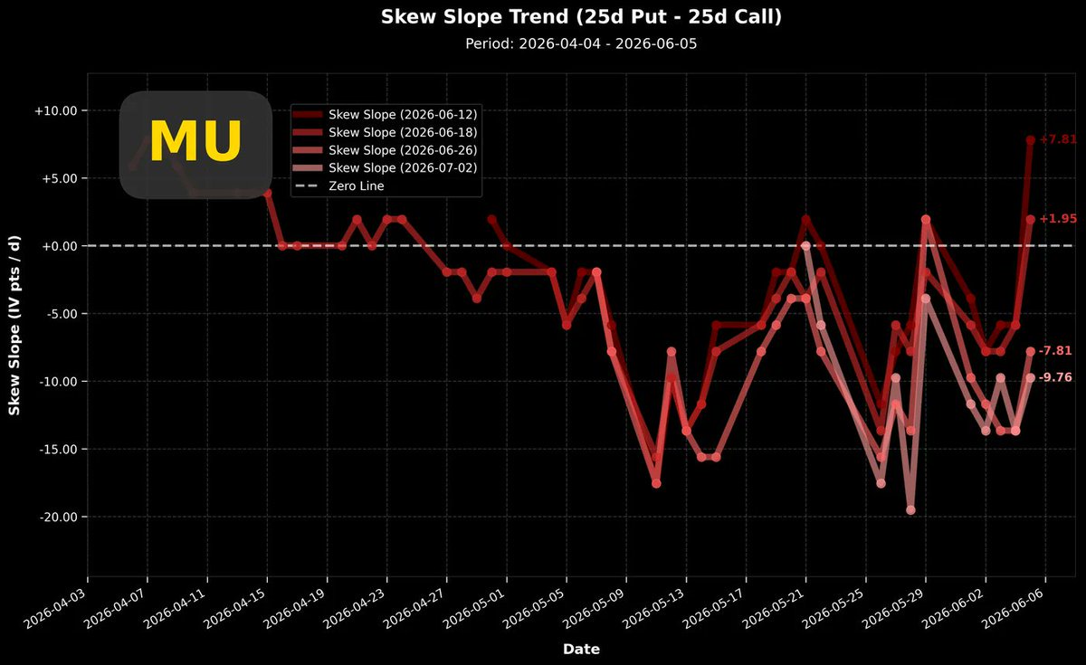
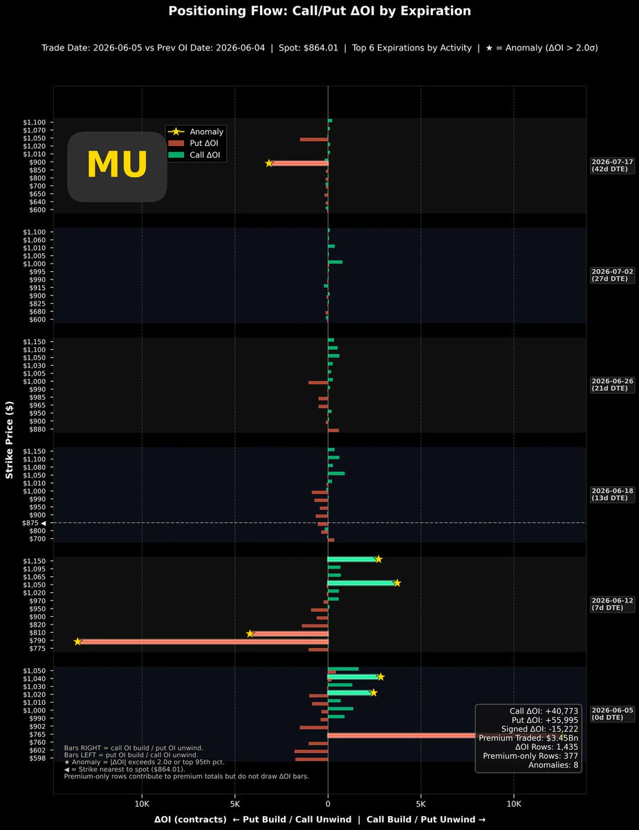
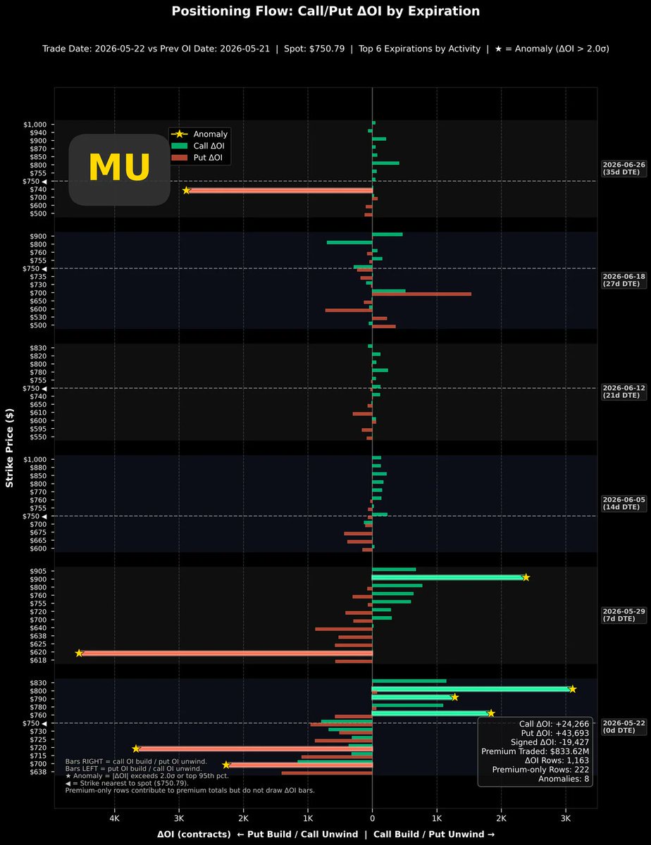
$Micron Tech(MU.US) Micron is the data pattern I've seen in the past two days that is relatively reassuring.
The top-left chart is the short-term volatility trend chart. Although the stock price has experienced a significant decline recently, volatility has remained high and even reached new highs in recent trading days. The options expiring next Friday have already reached 106%, and even after deducting the earnings report effect baseline, they are still in an upward trend.The top-right chart is the Put/Call volatility spread trend chart. Among the options expiring in the next month, the two nearer-term options have already returned to a positive spread state. This marks the end of a more than one-month period dominated by bullish sentiment. If the market can shift back to being dominated by bearish sentiment and maintain it for a while, it will be particularly beneficial for the stock price consolidation.The bottom-left chart is the options position change chart. The options expiring in 7 days and 42 days show a relatively noticeable increase in new bearish (put) option positions, while other options do not show active opening of bullish (call) positions.The bottom-right chart is the single-day position change chart from last Friday. The active opening of bullish (call) options has not decreased. Note that at a time when the stock price and the overall market environment have clearly pulled back, the opening of bullish options has not cooled down, which is a rather special signal. However, because the volatility spread continues to move towards positive values, I would not interpret these new bearish positions as long positions entering the market.Conclusion: $Micron Tech(MU.US) market participants have shown a moderate retreat into bearish positions, but overall volatility is rising instead of falling. This state makes me feel that upward momentum can restart at any time. Do not short $Micron Tech(MU.US) lightly. Although the stock price continues to fall, the trading data is already relatively healthy among various stock categories.+1
C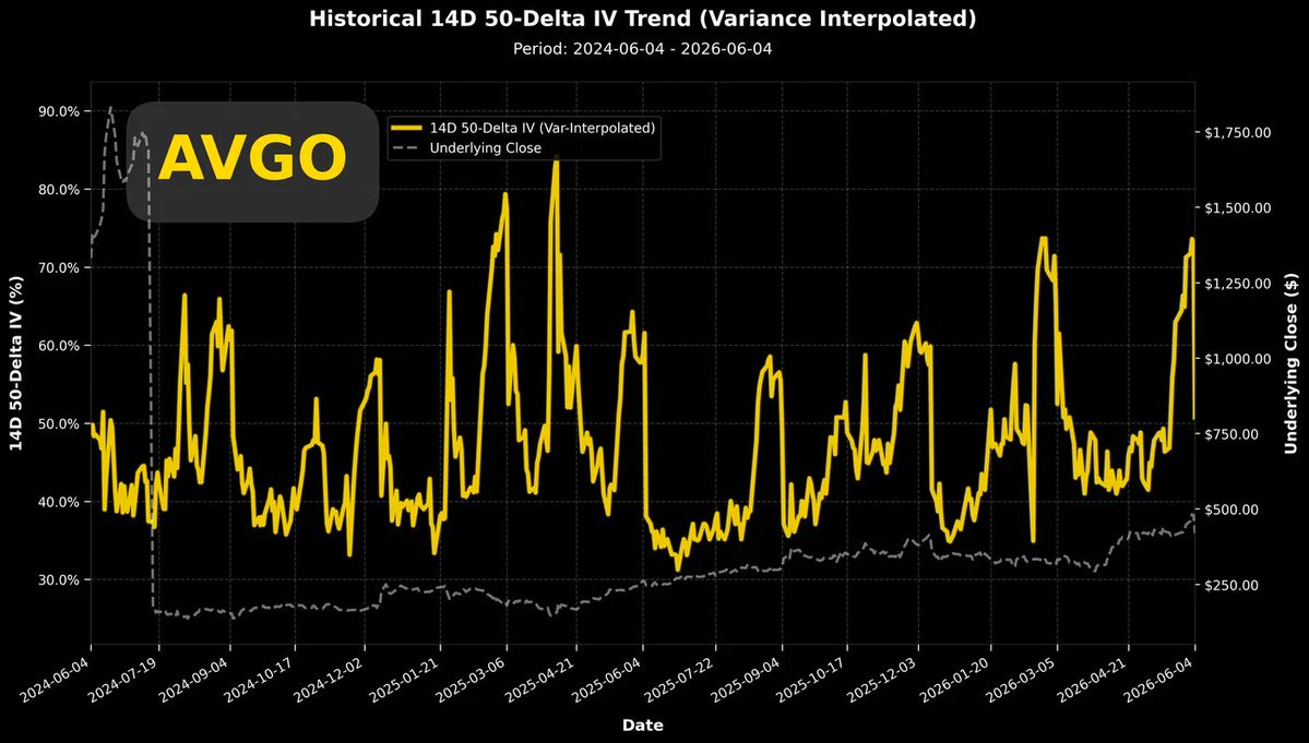
 +1
+1
After $Broadcom(AVGO.US)'s earnings report, a full trading day has passed. Now, we're trying to analyze the current situation using options trading data. Just one trading day after the earnings, the overall implied volatility has almost returned to its pre-earnings initial value. The top-left chart shows that the current implied volatility has fallen to the upper edge of the pre-earnings benchmark. There will definitely be a wave of high and low fluctuations in volatility going forward. The key point we need to observe is whether the lowest point of the benchmark shows signs of gradually rising higher. If it does, that would be an early sign of the stock price preparing to reach new highs. The top-right chart shows the Put/Call volatility spread trend. I thought the shocking lesson of a single-day drop of over 12% after earnings could push the volatility spread back above the zero line in one day, but it didn't. In fact, it remains significantly below the zero line. In plain language: the single-day 12.59% drop didn't deliver a shocking lesson to market participants; they're still not scared enough! The bottom-right chart is a slightly more positive message. We see that the sharply falling stock price has already pushed the maximum pain point below some of the options. For the mid-June monthly options, it has now become possible for the maximum pain point price to catch up with the stock price. The maximum pain point for the 06/18 options is currently near $375. I believe this can be seen as the first support level where the stock price might potentially stop falling in the near term. The bottom-left chart is also not too optimistic. Even after yesterday's big drop, the correlation coefficient between stock returns and volatility remains at a strongly positive value. While not 100% accurate, this phenomenon usually appears around the peak of a stock price. Conclusion: $Broadcom(AVGO.US) currently shows no signs of stopping its decline; it hasn't fallen enough yet!
+1C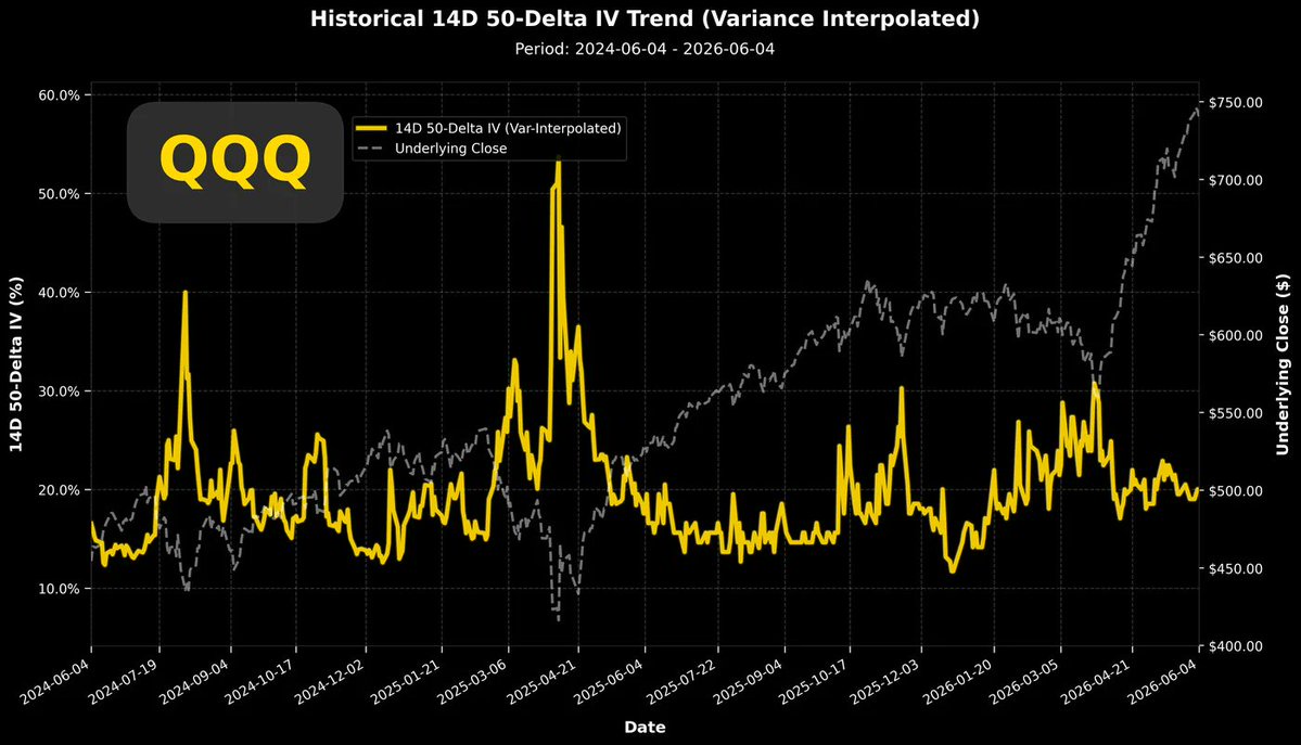
 +1
+1
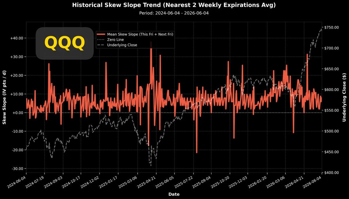
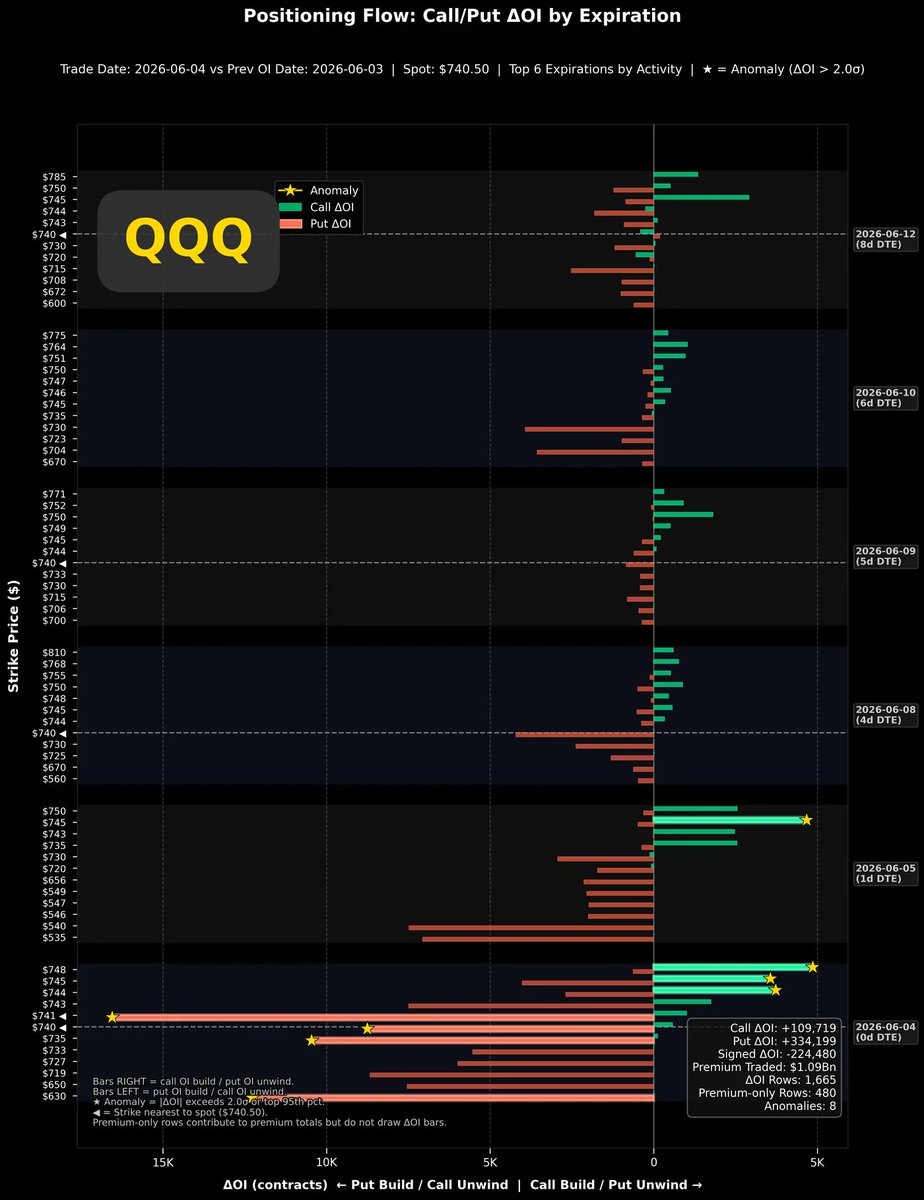
$QQQ seems to have fired the first shot after $Broadcom(AVGO.US)'s earnings report the day before yesterday, and then the market sentiment turned sour. During yesterday's session, the declines of many individual stocks were somewhat contained, but $Broadcom(AVGO.US), which ignited the fuse, still fell by 12.59%.
This decline is probably not something that can be resolved by a one-day pullback; at least $Broadcom(AVGO.US) hasn't shown any signs of stopping the decline yet.
If we look at the trading data of the broader market ($QQQ). The top-left chart shows the overall implied volatility over the past two years, which is currently in a neither-here-nor-there position. Whether it's going back to the low point at the beginning of the year or the high point in April, we can always deduce some ideas. Unfortunately, the current volatility is at a moderate 20% level.
The top-right chart shows the implied volatility over the past two years. The current volatility spread is also very close to past benchmark values, and like most sectors, it is dominated by the volatility of put options.
Quite pessimistic. According to the two charts above, if we are currently in a downtrend, we can say with certainty that we are still in the early stages, and there is still some distance to go before reaching near the bottom.
The bottom-left chart is the intraday position change chart. This chart is even more sensitive, showing active put option opening. But this is not necessarily bullish or bearish, because despite such obvious new put option positions, the volatility spread hasn't shown a significant jump (whether up or down).
The bottom-right chart shows an even worse characteristic.
How bad is it?
In the trading of the past year, the QQQ ETF has never had a positive correlation coefficient. In the past year, it was only in the last month that the stock price return and volatility showed a positive correlation for the first time.
The bottom of a stock price is more often associated with a highly strong negative correlation, while the top of a stock price is prone to trading overheating.
When the stock price rises and the call option volatility also continues to rise, this is a behavior of chasing prices to buy Calls. When the stock price falls slightly, the volatility of Calls also falls in sync. The bullish sentiment is shallow; it follows rises and flees from falls. This synchronized, sensitive state is the primary condition for incubating a significant downtrend.
Conclusion: Everyone, be careful! There are no signals of a price bottom, and some signals indicate that the main decline phase has not yet appeared.
+1C

 +1
+1
Tonight's dinner was the most moving meal I've had since coming to Japan. I didn't do much research beforehand, just found a highly-rated eel restaurant near today's hotel. Upon arrival, I realized the shop was even older and more worn than I imagined. If you're not careful when flipping through the menu, the whole thing might fall apart.
Since eel cuisine prioritizes freshness, the owner only started preparing after we placed our order. The process involved many steps and was quite time-consuming. After getting the owner's permission, I filmed him working from the side.
After taking a few photos, I sat down to have a drink. While waiting, I inadvertently noticed a yellowed, mottled "Seikin-sho" (Diligence Award) hanging on the wall. Asking AI to analyze the content of the "Seikin-sho," I was surprised to find it was a certificate awarded fifty years ago. In other words, the owner is probably around eighty years old now.
For over fifty years, he has focused on doing one thing every day: eel rice. The existence of this shop and the bowl of eel rice before me are the most concrete manifestation of "shokunin kishitsu" (craftsman spirit).
Boris Cherny, senior engineer at the Anthropic team and creator/head of Claude Code, was interviewed by host Lenny Rachitsky. Lenny asked him, "Once AGI (Artificial General Intelligence) is fully realized one day and humans no longer need to write code for a living, what do you plan to do?" Without hesitation, Boris answered that his next goal is to return to Japan, seclude himself, and devote himself to fermentation techniques, aiming to create the most authentic, perfect miso soup in all of Japan, even the world.
After tonight's dinner, I think I have my own answer. If one day I achieve what I consider the "complete Holy Grail" in the field of trading, then my next job will be to come to Japan and learn to make authentic eel rice: "Three years to skewer, eight years to split, a lifetime to grill."
+1C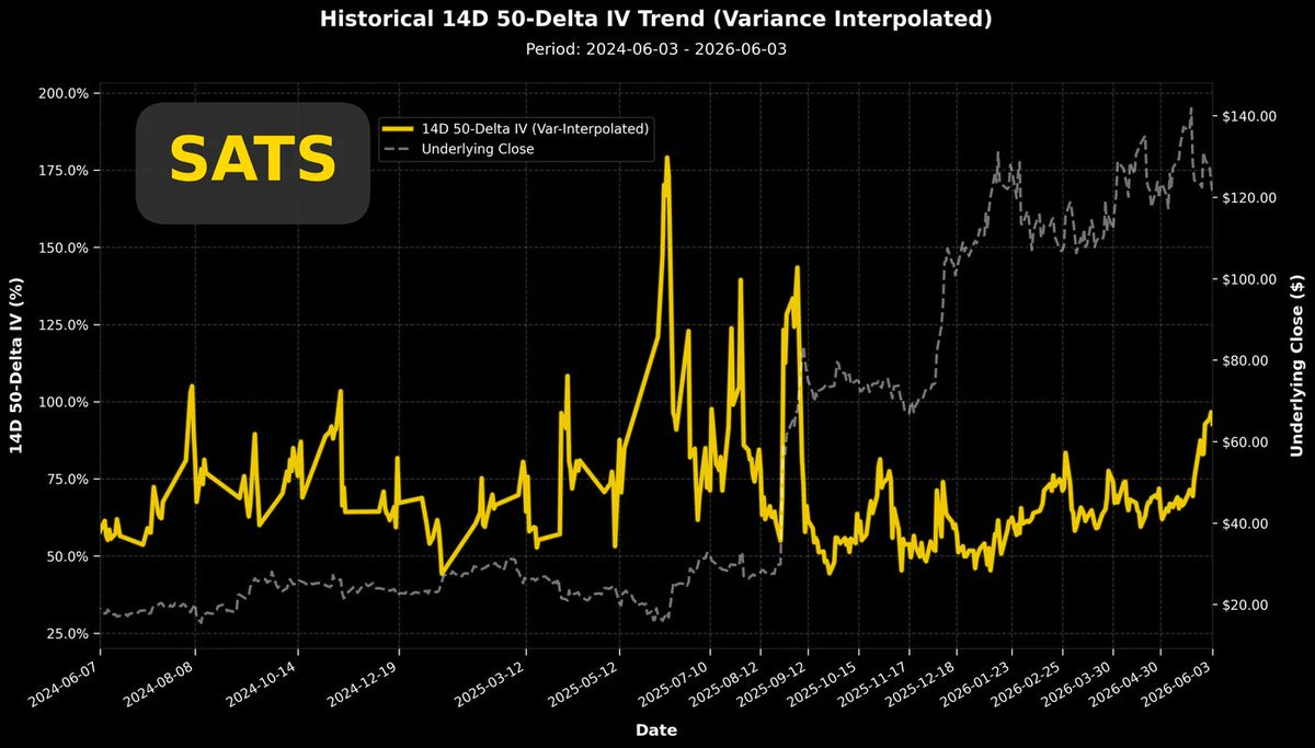
 +1
+1
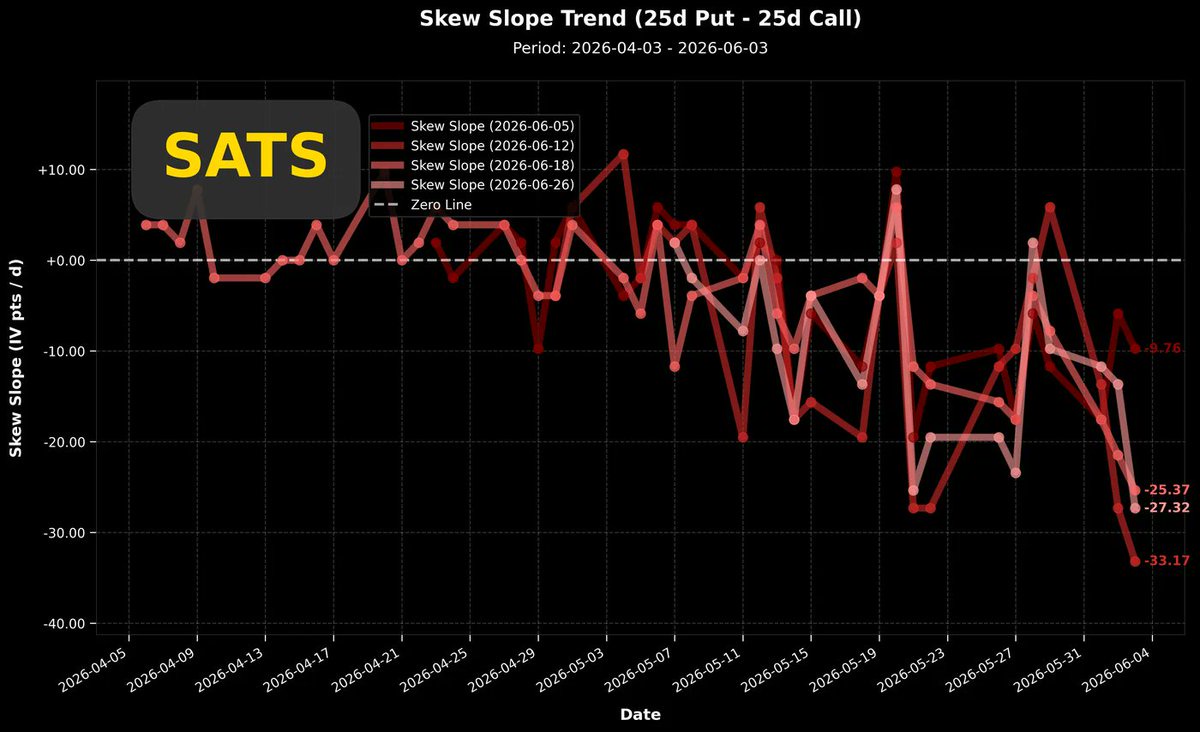
$Echostar(SATS.US) acquired SpaceX equity by "selling spectrum." In 2025, it reached a spectrum transaction with SpaceX (AWS-4H block, approximately 65 MHz), with SpaceX paying a large amount of cash plus up to $11 billion worth of SpaceX stock. This deal significantly improved EchoStar's balance sheet and resulted in SpaceX holdings accounting for an extremely high proportion of $Echostar(SATS.US)'s market value.
Since the rocket explosion incident of Blue Origin, the stock performance of space-related stocks has not been good, and we haven't looked at $Echostar(SATS.US)'s trading data for a while.
Overall implied volatility of $Echostar(SATS.US) over the past two years (top-left chart): Although the stock price has recently pulled back, implied volatility remains high. This high level is unlikely to come down before SpaceX's IPO. Comparing its historical record, the peaks of particularly high implied volatility did not correspond to stock price tops; they even had the potential to be starting points for rallies. From this perspective alone, it is positive.
Volatility is still present; stock price momentum is still present.
The top-right chart shows the recent trend of the Put/Call volatility spread. This result surprised me. We can see the volatility spread entering a deep negative range, with current call option buying momentum extremely strong. Interestingly, even though the stock price has significantly retreated, the momentum of long-side chasing is even stronger.
The bottom-left chart separately plots the volatility of options. It is very clear that the strong SpaceX IPO narrative persists, and for all options expiring within the next month, call option volatility is significantly higher than put option volatility. Long-side momentum is very strong and confident, ignoring the recent stock price decline.
The bottom-right chart shows that in the last trading session, there was a significant scale of call option closing positions. If the volatility spread continues to move more negative even while these positions are being closed, I speculate that the closing was led by buyers. Sellers who originally sold call options took profits and exited early, taking advantage of the significant recent stock price decline.
Conclusion: Although the $Echostar(SATS.US) trading landscape still has a strong $SpaceX IPO narrative component, even disregarding this event, $Echostar(SATS.US) trading remains dominated by call options.
+1C
 +1
+1
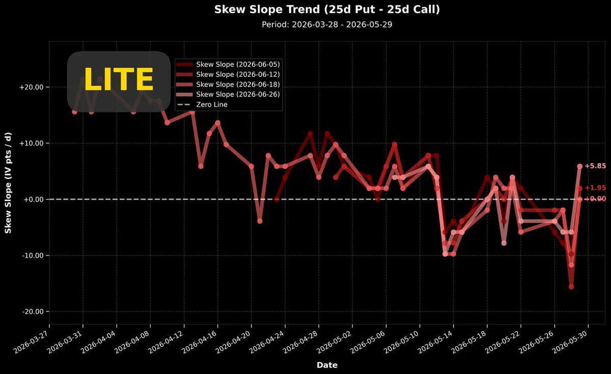
There's no bad news heard about $Lumentum(LITE.US)'s fundamentals. The current stock price movement looks more like a pullback after a rally.
The implied volatility in the top-left chart shows a relatively low earnings peak, and the baseline value before and after earnings is in a gradual downtrend.The stock price currently seems to show signs of forming a top. If the implied volatility maintains this declining baseline, the stock price will definitely enter a consolidation phase. If implied volatility can rebound similarly to early March next week, then there's still some hope for the stock price.The top-right chart shows the recent volatility spread, which hit its deepest negative value recently on 05/28. Call options once sparked a rally, but bounced back above the zero line within one trading day.Monday and Tuesday's trading are crucial. If trading over the next two days can clearly return to negative values, then the one-month downtrend in the volatility spread has a chance to continue.The worst-case scenario is that in the upcoming trading sessions, volatility continues to decline slightly with small oscillations, and the volatility spread also remains above the zero line. This pattern would declare the end of the stock price's upward movement.The bottom-left chart is a zoom-in of the volatility trend. Both the green dashed line (Calls) and red dashed line (Puts) have fallen to relatively low levels since the beginning of the year.The bottom-right chart shows the single-day options position change on Friday last week. Bullish and bearish bets were about even, with bearish option open interest for next Friday (06/05) even slightly stronger. If this situation continues, we are likely to see the volatility spread return above the zero line.Conclusion:Although the decline in volatility and the return of the volatility spread above the zero line (Put-dominated) effectively declare the end of a rally, this is also a necessary incubation condition for the next rise. Those who are very bullish on $Lumentum(LITE.US)'s fundamentals can look to add long positions at points of particularly low volatility before the next earnings report. That time hasn't come yet. Has the rally already ended? We'll need to watch for another two or three trading days.+1C
 +1
+1
$IBM(IBM.US)'s stock price has risen 38% in the last 11 trading days, mainly due to significant positive news in the quantum computing field, coupled with funding support from the Trump administration, which has triggered strong buying in the market.
We can trace back from options data to see that some funds had already entered the market before the news was released.IBM announced that it will invest over $10 billion in the next five years to develop quantum computing, with the goal of building a large-scale, fault-tolerant quantum system by 2029. This includes R&D, manufacturing, acquisitions, and collaborations.At the same time, the U.S. Department of Commerce allocated $2 billion through the CHIPS and Science Act to nine quantum companies, with IBM receiving the largest single grant of $1 billion to establish the first "pure-play quantum wafer fab" in the U.S. in Albany, New York.$IBM(IBM.US)'s stock price has risen sharply recently. From the top-left chart, we can see implied volatility rising sharply, with the stock price (white dotted line) climbing almost vertically, and implied volatility catching up quickly, though slightly lagging.Meanwhile, the top-right chart shows the volatility spread trend over the past two years. The current volatility spread is deeply negative, indicating that market trading is clearly dominated by momentum-driven bullish buying. Looking back at the data from the past two years, the last time it was this negative was in mid-2024, after which a six-month uptrend followed.Now the volatility spread is extremely negative, and the current pattern, in terms of both depth and breadth, is unprecedented.$IBM(IBM.US) is experiencing a rare bullish atmosphere in recent years.The bottom-left chart shows the change in options positions during a single trading day on Friday. The enthusiasm for opening bullish options positions was overwhelmingly stronger than for bearish options.The bottom-right chart shows the daily change in $IBM(IBM.US)'s bullish options positions since early April. In this heatmap, we can see an abnormally active bullish options opening signal as early as 05/08, with the strike price heavily concentrated at $260. 05/08 was not the recent bottom of the stock price; the lowest point in the past year occurred on 05/13.The background of the initial position building on 05/08 was that the stock price was still in a significant downtrend. The continuous large-scale entry of $260 strike price positions was already unusual. After the $260 positions were built, a few days later (05/13), the stock price began to rise from the bottom. The $260 strike price bullish options gradually exited by taking profits, until 05/22 when large-scale bullish options positions emerged due to news catalysts, and the $260 options still chose to close their positions at that time.Below are two key time nodes:May 21st → CHIPS Act + Anderon quantum wafer fab news officially released (first wave of positive news)May 28th → IBM's $10 billion quantum investment + Project Lightwell news officially released (second wave, stronger catalyst)On 05/22, a large number of bullish options positions appeared, continuing until 05/29 when the scale of position building intensified further, completely driven by news-led bullish buying. During this sharp rise, options positions with strike prices set at $260 were usually one step ahead and conservatively liquidated in batches during the uptrend to lock in profits early.Frankly speaking, the above two policy-level positive developments are certainly very beneficial for $IBM(IBM.US). However, for these things to translate into actual revenue is a distant future.Will the stock price rise further?Of course, it's possible. After all, the potential for more support from the Trump administration cannot be ignored. But this is a completely different logic from the stock price rise of $Micron Tech(MU.US), $Taiwan Semiconductor(TSM.US), $NVIDIA(NVDA.US), which is based on actual revenue backing.+1C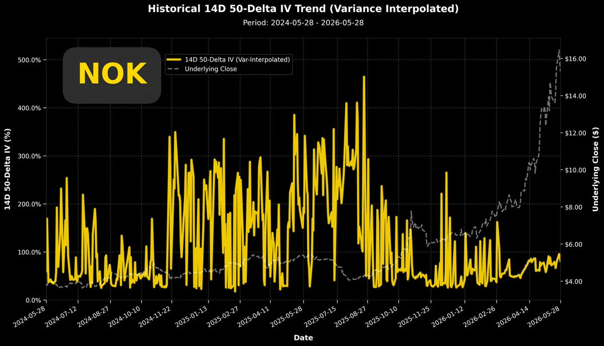
 +1
+1
$Nokia Oyj(NOK.US) I no longer highlight $Nokia Oyj(NOK.US)'s low implied volatility rank now, because that would cause misunderstanding. In fact, if you only started looking at its implied volatility in March this year, you would judge the current volatility to be very high. It only reached the peak volatility (110%) on 05/26. However, if you include the volatility jitter caused by liquidity factors earlier, you would misjudge the current volatility as seemingly very low.
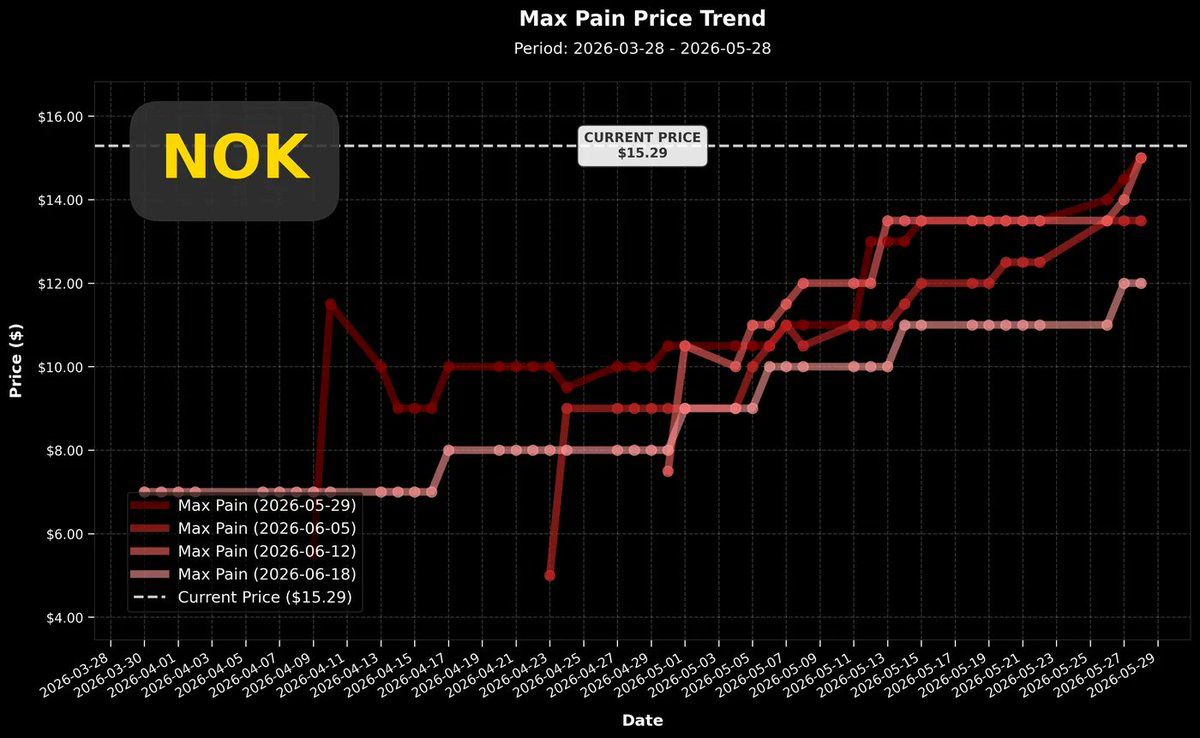
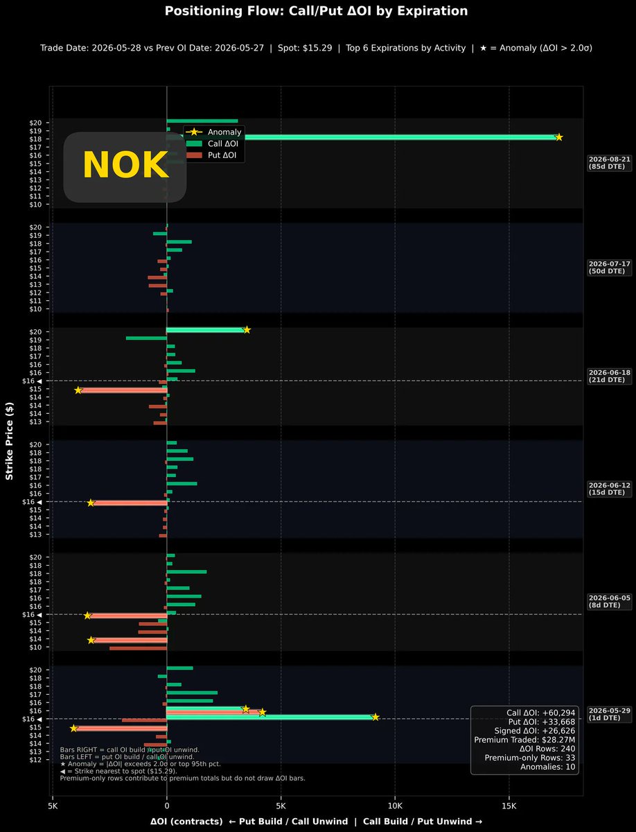
The top-right chart shows the maximum pain point price trend for the most recent one-month options. Although $Nokia Oyj(NOK.US)'s stock price has been rising continuously, the price drop in the last two days has allowed the maximum pain point to catch up. 06/18 belongs to the monthly options, which have already accumulated over 200,000 contracts in open interest, making it relatively more difficult to move, but it can still be seen to have been continuously rising over this month. These are patterns relatively favorable for subsequent stock price increases.The bottom-left chart is the single-day open interest change chart for $Nokia Oyj(NOK.US) after two consecutive days of price decline. It can be seen that the opening of call options is still relatively active. Surprisingly, options expiring in 85 days even saw new call open interest of 16,000 contracts at a strike price of $18. Since the Put/Call volatility spread has fallen below the zero line, the positions should be primarily established by buying pressure. The bottom-right chart is the open interest change chart for call options from early April to the present. This heatmap shows that the most actively traded call options are distributed at strike prices of $16~$17. It wasn't until yesterday that a large amount of open interest appeared at the $18 strike. The stock price only experienced a slight adjustment, which does not affect the confidence of market participants. Call option buying on the rise is still active, and the distribution of strike prices has actually moved upwards.+1C
Next week, I'm taking my parents on an 11-day trip to Japan, and I'm a bit worried that my daily options data analysis output might be affected. I'll bring my laptop and will try my best to keep posting analysis articles every day after returning to the hotel in the evening.
C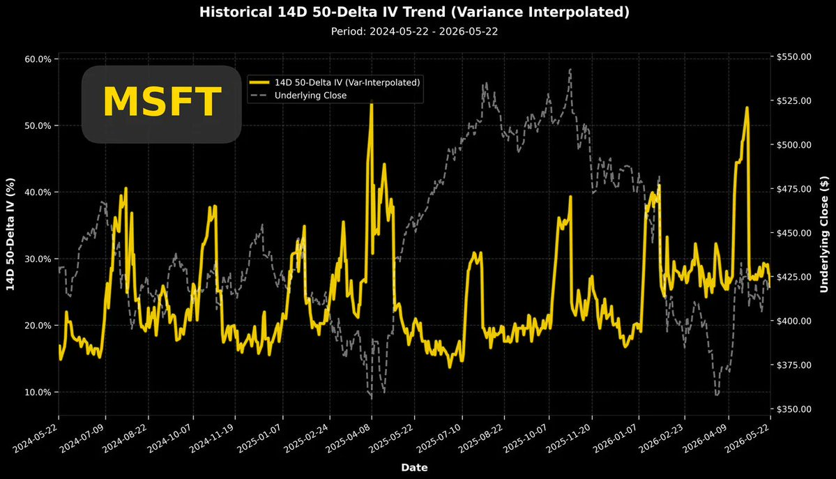
 +1
+1
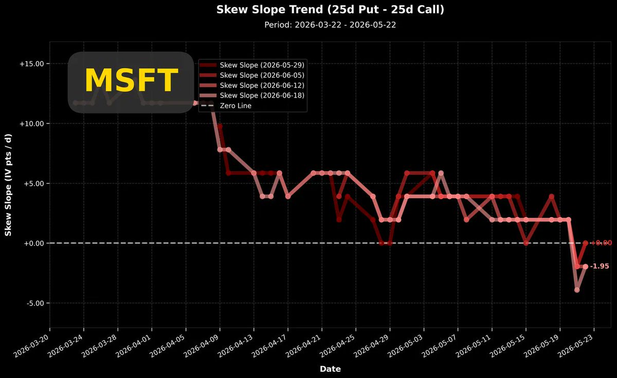
$Microsoft(MSFT.US) In 2026, Microsoft continued its decline from 2025. With the rise of the Claude model launched by Anthropic this year, Microsoft's stock price fell more sharply this year, dropping from the beginning of the year to early April, hitting a two-year low of around 355.
The top-left chart shows the long-term volatility trend. It can be observed that at the end of last year, the decline in stock price also drove down volatility, with a slow decline accompanied by a decrease in trading activity.
However, after the earnings report at the beginning of the year, a new baseline was established. Subsequently, even as the stock price fell to early April, volatility did not decrease.
Although the decline in $Microsoft(MSFT.US) started last November, for the same downward wave, market participants had two different trading sentiments.
Entering 2026, the continuous decline has instead kept implied volatility at a higher baseline (~25%). I believe that if the stock price falls below $425, it might trigger some holders to consider buying insurance for a deeper decline (buy put), while others might think it's time to enter the market and buy call options because Microsoft is already oversold.
Both sentiments lead to a continued decline in the stock price but push implied volatility higher.
Until early April, the capital judging that $Microsoft(MSFT.US) was oversold gradually became mainstream. Therefore, you can see in the top-right chart that the short-term Put/Call volatility spread followed a gentle downward trend, even briefly falling below the zero line recently.
The rebound in $Microsoft(MSFT.US) in early April lacked sustained momentum. After the earnings report, the stock price stagnated and fluctuated at this level, while the overall implied volatility fell back to the pre-earnings baseline.
Interestingly, although overall volatility decreased, the buying pressure for call options still outweighed that for put options. Therefore, the Put/Call volatility spread did not return to the past pattern dominated by put options.
The bottom-left chart shows the daily change in $Microsoft(MSFT.US) option positions during last Friday's trading session. At this time, under conditions of low volatility, we can observe that call options were actively opened across all options, with a wave of capital very confidently bullish. In contrast, the opening of put options can only be described as sporadic.
The bottom-right chart shows the daily change in $Microsoft(MSFT.US) call option positions since March. Since May 18th, this unusual bullish buying sentiment has been continuously building call positions daily, with strike prices ranging from $420 to $440, until May 22nd when even more aggressive position opening occurred. Furthermore, judging from the volatility spread trend in the top-right chart, these long positions were dominated by buying, not by long-term holders selling covered calls.
+1C
 +1
+1
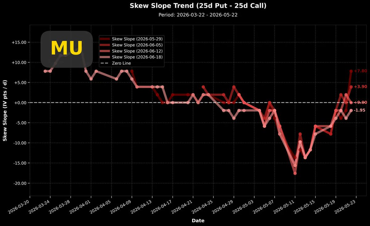
On 05/20, $Micron Tech(MU.US)'s CEO Sanjay Mehrotra publicly emphasized that "the company's balance sheet has never been stronger," reiterating that the demand for AI memory is a structural, long-term trend, which spurred a pre-market stock price surge of about 5%. Donald Trump's fundamental stance on the US controlling advanced manufacturing technology remains unchanged. As the most advanced domestic memory chip manufacturer in the US, it's really hard to find even a sliver of cause for concern. But the stock price has already surged significantly, so what is the current market state?
The top-right chart shows the short-term Put/Call volatility spread trend. The current trading sentiment has completely eased from the extreme, overwhelmingly bullish atmosphere.The volatility spread has returned to the zero line and above. Short-term options even show a value of +7.8%, beginning to approach the long-term benchmark (Put volatility is 10% higher).I believe the market won't return to the completely bullish state seen on 05/11 anytime soon, as such a state has only occurred twice in the past year. Perhaps the next occurrence will be in the second half of the year.The bottom-right chart plots the Put and Call volatilities separately over the past year. The green line is Call (bullish), and the red line is Put (bearish). Although both volatilities have declined significantly, they haven't yet returned to the pre-earnings benchmark, so we estimate they will continue to fall.Approaching 60% is considered a low volatility position unaffected by earnings reports.The top-left chart is a correlation analysis between stock returns and volatility. I've mentioned before that every complete upward wave experiences an alternation from strong negative correlation to strong positive correlation.This wave started rising in April, with a correlation coefficient of -0.5 at the time, and the red line (Put) showed an even more negative correlation. After this round of increase, the stock price formed a head-and-shoulders pattern, while the correlation coefficient also completed a more distinct head-and-shoulders pattern at a strong positive correlation (+0.75).Once the correlation coefficient shifts from negative to positive, it often signals the end of a wave and a transition to range-bound consolidation. Historical data suggests a high probability of a temporary pause, though not necessarily a decline.The bottom-left chart is the daily position change chart. This chart shows that only very near-term options have new bullish opening positions. The entire chart indicates that bearish option opening is more active. This is a completely different situation compared to the all-in bullish bets seen recently.+1C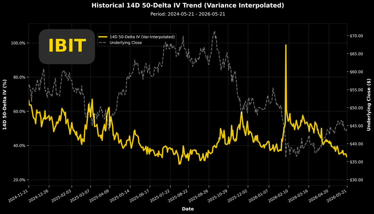
 +1
+1
$IBIT Because the implied volatility of IBIT (BTC ETF) is so low that it piqued my curiosity, I couldn't help but take a closer look at its trading data.
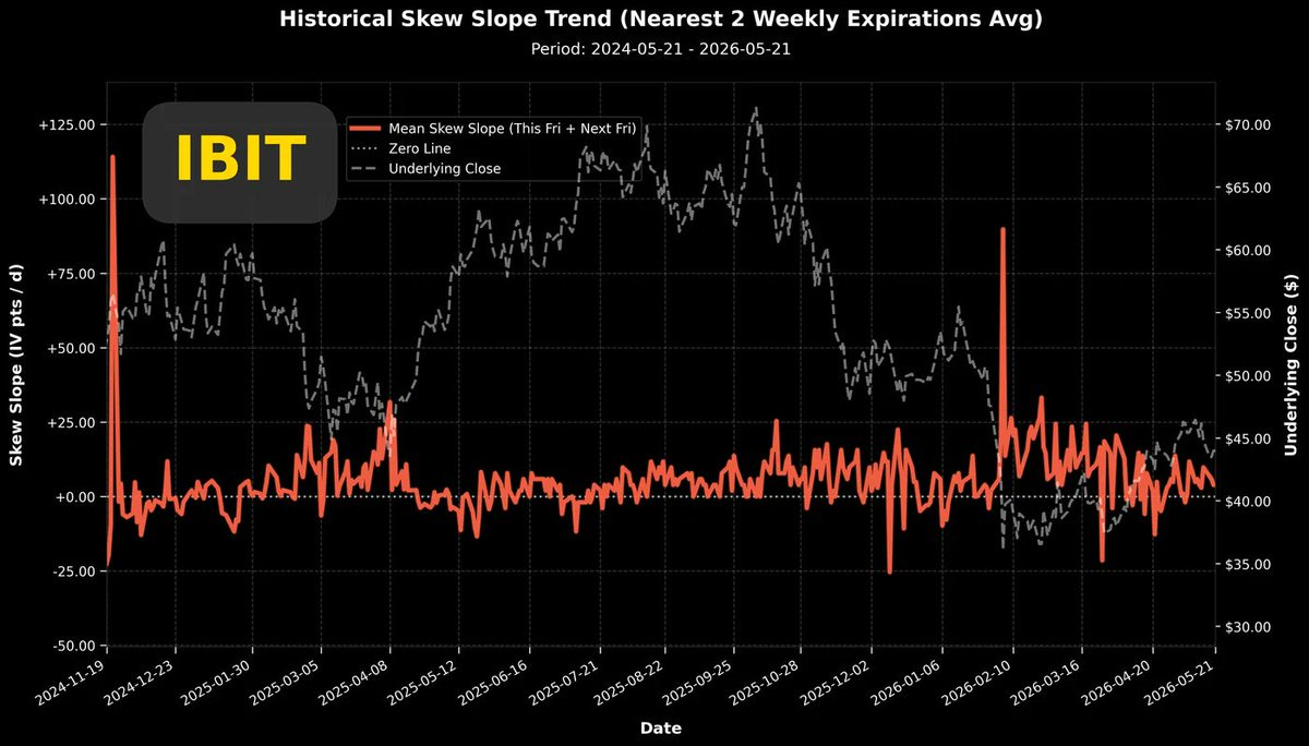
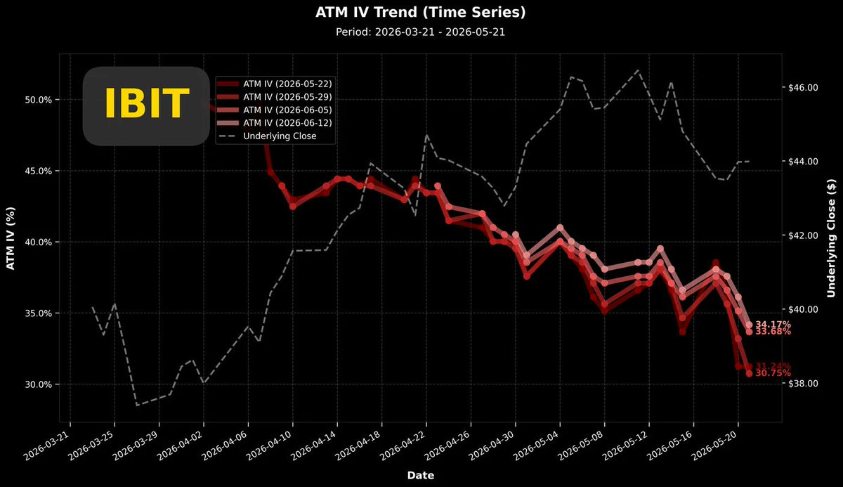
I'm quite old-fashioned; I hold cryptocurrencies but don't trade them, treating them simply as part of my asset allocation. Moreover, I still firmly believe in Bitcoin's four-year bull-bear cycle.This year should, in theory, be a bear market year. Typically, the third and fourth quarters of a bear market year are the time to look for buying opportunities.This time is no exception for me, so for the entire first half of 2026, I've paid almost no attention to cryptocurrencies. My only remaining connection to them is the few hundred shares of $Strategy(MSTR.US) and $Coinbase(COIN.US) in my account.Depending on the situation in the second half of this year, I might buy some cryptocurrencies and then wait two years before paying attention again.However, the recent I.V. rank of $IBIT is just too low. Let's see what's going on with its data?First, look at the top-left chart. This shows the overall implied volatility trend over a two-year period. You can see that since February 10th of this year, when Bitcoin had its second major plunge, the implied volatility spiked, forming a new starting point for a volatility wave.From February 10th to today, May 22nd, the implied volatility of $IBIT has continued to decline. Even though the real-time stock price (BTC price) later showed a pattern of gradual increase, $IBIT's volatility has kept falling relentlessly.The last time it was at such a low level was around the end of August last year.The troubling part is that at that time, when the implied volatility was this low, it coincided with a peak in Bitcoin's price.If you look at this two-year chart, you'll find that relative lows in implied volatility often correspond to price tops. Conversely, highs in implied volatility often correspond to local price bottoms.Now, with $IBIT's volatility at a very low level, don't you think that's scary?The top-right chart shows the two-year Put/Call volatility spread. We can see that the local highs in volatility observed in the top-right chart usually correspond to local highs in put option volatility. The two align perfectly.So, if any friends want to build a Bitcoin position in the second half of the year like I do, how should they look at it?At the very least, we need to wait until put option volatility significantly surpasses call option volatility.But for such a scenario to occur, unsurprisingly, it would require a panic-inducing drop. Can we overextrapolate from this and assume there will be another drop in the second half of the year?That would be a bit of a stretch. This data isn't predictive; it merely describes the current state! Whether there will be a panic-driven drop in the second half of the year, neither the data nor I can predict. But if such a state does appear, it would be a great entry opportunity with a favorable risk-reward ratio.The bottom-left chart shows recent volatility trends. This chart displays four different option expiration dates, from near to far, showing a highly consistent volatility trend. Volatility is declining consistently from near-term to long-term, even as the stock price shows a pattern of gradual increase. Stock price and volatility show a negative correlation!Finally, let's look at the bottom-right chart. This is the options position change chart from yesterday's trading. Although call option opening was relatively active, these new positions were not formed by very aggressive chasing buying, as the Put/Call volatility spread is currently even above the zero line.+1C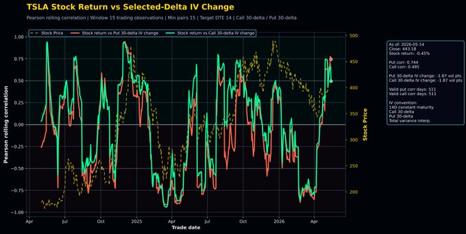
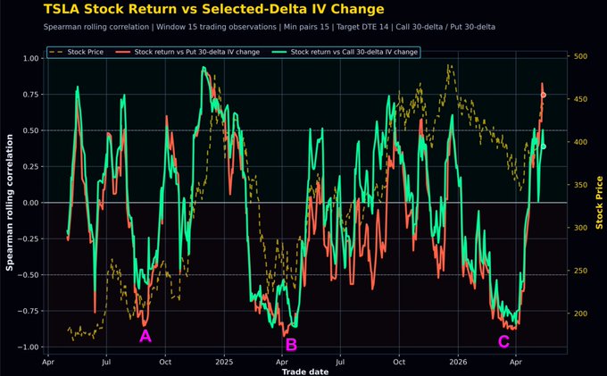
Featured[Options Talk] Educational Article: Analysis of the Correlation Between Stock Price Returns and Implied Volatility ($TSLA)
Analyzing the correlation strength between stock price and volatility is a relatively uncommon analysis, so I specifically wrote this article for educational purposes. In this article, we'll discuss this chart from a beginner's perspective: Below is a development script using historical option chain data, taking $Tesla(TSLA.US) as an example, the correlation coefficient between stock price return and implied volatility change. There are only two variables, defined as follows: Stock equity (return): The simple return rate of the closing price over the next two trading days. Implied volatility change: The implied volatility of options with DTE=14 days...

C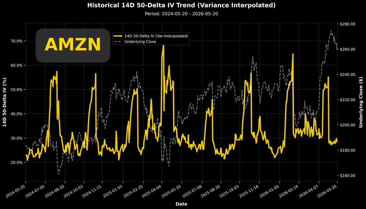
 +1
+1
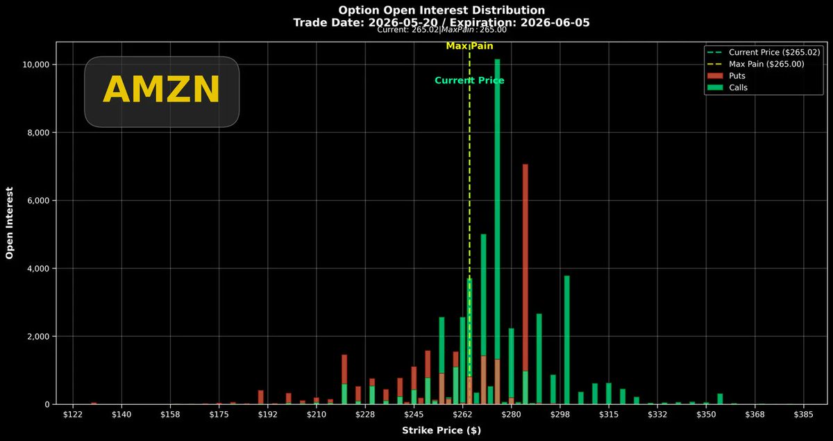
After Amazon's earnings report, $Amazon(AMZN.US)'s stock price retreated, and its implied volatility also dropped to a new low for the year. From the two-year volatility trend chart in the top-left graph, it can be seen that during the stock price's pullback from the high, the implied volatility gradually rose from the bottom, showing a relatively healthy negative correlation.
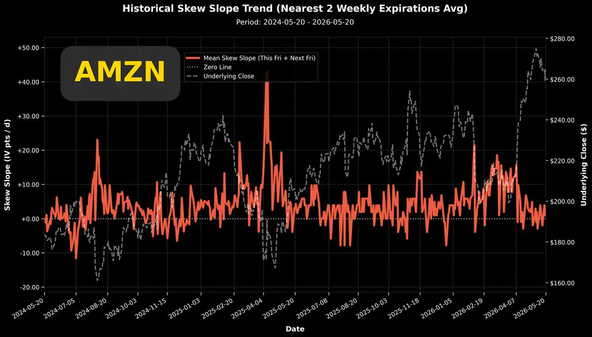
The top-right graph shows the two-year trend of the Put/Call volatility difference. The current difference is above the zero line, which is also the baseline value for the past two years.In this volatility difference chart, three dates are worth noting: 2024/08/15, 2025/04/04, and 2026/03/05.Around these three dates, you can see the brick-red lines all show a raised head pattern, which corresponds to the local lows of the stock price. $Amazon(AMZN.US) has this commonality: when the put volatility is significantly higher than the call volatility and persists for a period, it often indicates a local low in the stock price.The bottom-right graph shows options expiring within the next month. The maximum pain point price has caught up with the stock price, making the recent $Amazon(AMZN.US) pullback worthwhile. The maximum pain point price catching up with the stock price helps initiate a new round of upward movement.In the position accumulation chart, I found that for options expiring on 06/05, there is an in-the-money put option with a size of about 7,000 contracts, with a strike price likely at $285.I checked that the previous high of the stock price was only $278.5. In other words, these 7,000 contracts were in-the-money puts when initially established. The liquidity of in-the-money options is slightly worse, and with a size of 7,000 contracts, this operation is very unusual and extremely rare.Of course, buying in-the-money puts can be interpreted superficially as a short position with lower leverage. Since the initial strike price is set in-the-money, the probability of the position expiring worthless due to unfavorable price movement is less than 50%. It's a slightly more conservative shorting operation.The above view assumes that these 7,000 contracts were primarily formed by buyers.Let's look at the bottom-right graph again. This heat map shows the daily position changes for put options recently.If we focus on the $285 strike price (the far-left edge of the chart) and track from late March to today, there were only two days with significant put option accumulation: 05/08 and 05/19, with the accumulation on 05/19 being particularly intense (thousands of contracts).05/19 happened to be the worst trading day forming the recent stock price low ($255). I speculate that during trading on that day, traders or trading algorithms saw signs of further accelerated decline in the stock price, so they positioned in-the-money puts for a lower-leverage short.The above are all my speculations based on stock price and options trading data. Whether buying or selling, having such liquidity (without disturbing implied volatility) actually indicates that the forces on both sides are not significantly different.+1