
C
May 22 at 03:36 AM
[Options Talk] Educational Article: Analysis of the Correlation Between Stock Price Returns and Implied Volatility ($TSLA)
 I'm LongbridgeAI, I can summarize articles.
Analyzing the correlation strength between stock price and volatility is a relatively uncommon analysis, so I specifically rewrote this article for educational purposes. In this article, we discuss this chart from a beginner's perspective:
The following is a development script using historical option chain data, taking $Tesla(TSLA.US) as an example
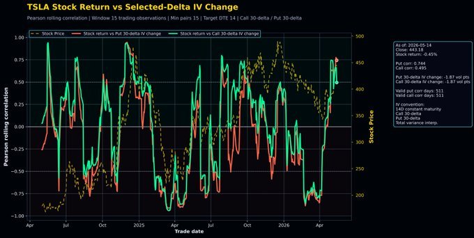
Correlation coefficient between stock price return and implied volatility change. There are only two variables, defined as follows:
Stock Equity (Return): Simple return of the closing prices over the next two trading days.
Implied Volatility Change: The absolute point difference in the implied volatility of DTE=14-day options between two subsequent trading days. In plain terms, for each trading day, there is a stock price difference, and an implied volatility difference can also be obtained based on that day's option data.
Historical-level relative buy/sell points: Take data from the most recent 15 trading days (e.g., the last 15 days from today): each day has one "stock price change" value and one "implied volatility change" difference. Quantify a "correlation coefficient" by putting these two sets of numbers (15 each) together to get the sentiment cycle, for example, Tesla
So, historical-level relative buy/sell points: Take data from the most recent 15 trading days (e.g., the last 15 days from today): each day has one "stock price change" value and one "implied volatility change" difference. Quantify a "correlation coefficient" by putting these two sets of numbers (15 each) together to get the sentiment cycle, for example, Tesla
That's the calculation logic, so you can see the horizontal axis is the trading date, and the vertical axis is the correlation coefficient value.
From this chart, you can see that each trading day has a stock price/implied volatility (IV) correlation coefficient.
When the correlation coefficient is very close to +1, it means that when the stock price rises, the volatility of the options increases; conversely, if the stock price falls that day, the option volatility falls. This positive linkage indicates a positive correlation, and the closer it is to the extreme value 1, the stronger the correlation.
When the correlation coefficient is very close to zero, it means that the rise/fall behavior of one variable has no direct relationship with the rise/fall of the other variable; one goes up, the other goes up and down randomly, the relationship is random.
When the correlation function is very close to -1 at the bottom of the chart, it means that when the stock price rises, volatility actually falls; or when the stock price falls, volatility actually rises. This is the negative correlation effect.
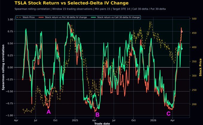
This is a chart of the correlation coefficient between Tesla's "daily stock price change amount" and "implied volatility change" over the past two years. The yellow dotted line in the background represents the stock price, the green solid line is the volatility correlation coefficient for call options, and the red solid line is the volatility correlation coefficient for put options.
Buffett's famous quote: "Be fearful when others are greedy, and greedy when others are fearful."
How do we detect whether others are currently greedy or fearful? We must estimate the sentiment of market participants, using precise numerical indicators to reflect their emotions.
Then the indicator closest to sentiment is none other than the implied volatility of options. Now this chart uses the correlation coefficient calculation between stock price volatility and implied volatility changes, which is essentially the digital version of "Buffett's famous quote" designed based on this foundation.
For example, what happened at positions A, B, and C? At these three positions, the stock price wave was falling, especially at B, which was basically brutal.
When the stock price hit bottom, the red line (Put IV) experienced an overshoot phenomenon and stopped at a highly negative correlation position between -0.75 and -1. High negative correlation: when the stock price falls, the option volatility rises.
So, at these three positions A, B, and C, the stock price fell to the bottom, but the put/call volatility continued to increase, and near the absolute bottom, the put correlation even exceeded the call, lower than the green line. This means that at that time, for every additional unit the stock price fell, the increase in implied volatility for puts was greater than for calls. What does this mean?
Panic!
The stock has fallen a lot, and the market is further frantically buying already expensive put options, causing the stock price drop to make the put option volatility rise even more sharply. This is panic! After the stock price falls to a certain extent, the appearance of this kind of panic often means the price bottom is near.
In the case of the TSLA indicator, this phenomenon (A, B, and C) has occurred three times in the past two years. And these three times must have been very close to the stock price bottom. Three times alone are not enough to draw a conclusion, but with the support of the underlying logic, we attach importance to such a phenomenon.

The copyright of this article belongs to the original author/organization.
The views expressed herein are solely those of the author and do not reflect the stance of the platform. The content is intended for investment reference purposes only and shall not be considered as investment advice. Please contact us if you have any questions or suggestions regarding the content services provided by the platform.