
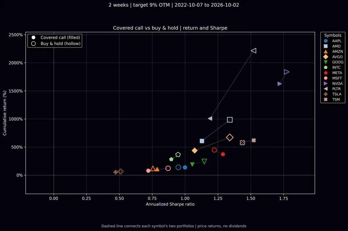
Certain tickers are indeed suitable for Covered Call strategies, which can enhance the performance of your stock holdings. To evaluate the long-term benefits of Covered Calls, we have expanded our backtesting to include more tickers and plotted their cumulative returns and annualized Sharpe ratios in the chart below.
Each ticker has its own unique symbol on the chart. Solid symbols represent a strategy of holding the underlying stock while continuously selling covered calls, whereas hollow symbols represent a simple buy-and-hold strategy.Holding Period: Oct 2022 – Oct 2026 (4 years total)Out-of-the-Money (OTM) Strike: 9% premiumDTE = 2 weeks (strictly Friday expirations)Backtesting over the four-year period reveals that most solid symbols cluster in the bottom-left quadrant, indicating lower Sharpe ratios and lower cumulative returns.Ideally, we would want to identify a strategy that shifts the solid symbols toward the top-right corner, representing both high Sharpe ratios and high returns.In fact, three tickers proved highly suitable for Covered Calls over the past four years:- **TSMC ($Taiwan Semiconductor(TSM.US))**: Executing Covered Calls yielded higher cumulative returns and a significantly improved Sharpe ratio.- **Apple ($Apple(AAPL.US))**: While Covered Calls did not generate higher cumulative returns than holding the stock alone, they did improve the Sharpe ratio.- **Amazon ($Amazon(AMZN.US))**: Covered Calls slightly boosted the Sharpe ratio.- **Meta ($Meta Platforms(META.US))**: Cumulative returns decreased, but the Sharpe ratio increased.Out of the 12 tickers analyzed, data from the past four years highlights three specific stocks that benefit from Covered Call strategies. This approach requires no technical analysis or subjective judgment; it is a mechanical execution of selling two-week-to-expiration covered calls every other week. Simply following this routine can enhance the Sharpe ratio for select individual stocks.Therefore, based on statistical data, it is inaccurate to claim that Covered Calls are entirely ineffective. However, the actual impact varies significantly depending on the individual stock.
CurryOption

C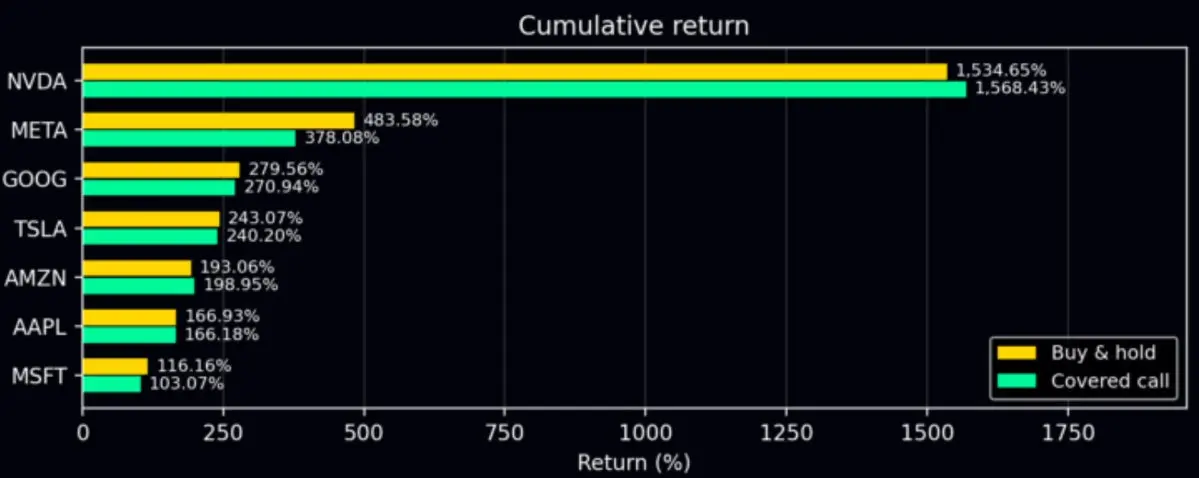
For holdings in the portfolio, does implementing Covered Calls over the long term actually enhance returns?
Opinions on this question vary. I conducted a small backtest during the holiday period, covering the date range: 2023-01-03 to 2026-10-02.Days to Expiration (DTE): 2 weeks.Strike price set at 9% OTM.Using the US Magnificent Seven tech stocks as an example, the backtest results show that only NVDA and AMZN slightly outperformed long-only stock holding; for the other stocks, buying and holding without writing covered calls yielded better returns.This result may surprise many. However, it's understandable that people have the illusion that selling options is easy money, because selling out-of-the-money options, especially those 9% OTM, are inherently high-probability strategies.Unfortunately, historical data suggests that if the underlying asset is one of the Magnificent Seven tech stocks that have surged significantly in recent years, Covered Calls tend to be high-probability but negative expected value strategies.$Apple(AAPL.US), $Microsoft(MSFT.US), $Alphabet - C(GOOG.US), $Amazon(AMZN.US), $Meta Platforms(META.US), $NVIDIA(NVDA.US), $Tesla(TSLA.US)C![图片 1,共 1 张]()
Dots is far from a mature product, or to put it bluntly, it hasn't even reached the stage where it's ready for launch. I started my morning by upgrading the subscription and then enthusiastically granted read-only access to two x86 machines and one Mac to Dots. At first, it seemed to be busily handling some tasks on the computer with a semblance of competence, making me think, 'Well, maybe this is good enough.'
I even gave Dots (which I've temporarily named Jack) a heads-up:[Do a good job. I'm going to do strength training and then run for a long time on the treadmill. I'll call you back to check your progress...]But guess what? The guy didn't answer my call!Usually, I communicate with Codex via text boxes, so I don't treat it like a real person. But Dots' interface is designed to look like a human assistant, complete with a phone feature. When the 'person' on the other end doesn't pick up, the 无名 anger bubbling up inside me is something no AI could possibly handle.In the end, he still didn't answer. I had already prepared my opening line: [It's working hours! What do you mean by not answering the phone?]But I never got the chance to scold it.... More importantly, the voice conversation feature still isn't available. If I can't use that, I might as well go back to using the old Codex with Computer Use. What kind of new product is this?C![图片 1,共 1 张]()
Out of curiosity, I pulled out a basket of hot stocks to perform Dynamic Time Warping (DTW) waveform similarity calculations. In the heatmap below, brighter colors indicate more similar stock price waveforms. This is a type of waveform similarity that traditional linear correlation coefficients cannot capture.
The high similarity between $Micron Tech(MU.US) and $Sandisk(SNDK.US) is not surprising.It's interesting that the waveform similarity between $Micron Tech(MU.US) and $AMD(AMD.US) is higher than that between $Micron Tech(MU.US) and $Intel(INTC.US); I didn't expect that.$Intel(INTC.US) also shows high similarity with storage-focused $Sandisk(SNDK.US).$NVIDIA(NVDA.US) and $Amazon(AMZN.US) also exhibit strong similarity, with their similarity magnitude approaching that of $Micron Tech(MU.US) / $Sandisk(SNDK.US).Notably, $Microsoft(MSFT.US) and $Meta Platforms(META.US) appear almost entirely black in the heatmap, indicating very low waveform similarity with other assets. In other words, these two are well-suited to hedge or diversify your total portfolio volatility, as their price movements diverge significantly from the broader market.
C
Over the past couple of days, AI frontier models have been going at it again: Gemini 3.8 FLASH/MUSE/Fable. Performance benchmarks look solid; next up is chatGPT 5.7 or 6 (Astra). I don't think chatGPT will widen the gap, though model capabilities may start to diverge—while chatGPT could lead in reasoning, Fable may maintain its edge in coding. For true collaborative workflows, however, chatGPT Codex remains the most practical choice for now, given its more realistic usage quotas.
C![图片 1,共 1 张]()
[Relationship between Stock Price and Volatility Spread] If we use a bi-weekly timeframe, plotting the return of $Rocket Lab(RKLB.US) stock price on the y-axis against the volatility spread on the x-axis, we can visualize how the volatility spread changes during periods of significant price drops or rallies over two weeks.
The pink dots and dashed line in the chart below represent $Rocket Lab(RKLB.US), while blue represents $Apple(AAPL.US).Plotting four years of trading data on this chart reveals that when $Rocket Lab(RKLB.US)'s stock price falls, there is still a tendency for the volatility spread to rise, albeit very weakly, with a linear slope of only -0.03.For $Apple(AAPL.US), the stock price fluctuations within the bi-weekly timeframe are tightly distributed within +/-20%, and its volatility spread has remained positive over the years (partly due to long-term holders writing covered calls).The ups and downs of Apple's stock price show a stronger correlation with the volatility spread, with a linear fit slope of -0.241, which is 80 times that of $Rocket Lab(RKLB.US). This provides clear quantification: whenever stock price volatility occurs, the volatility spread of $Apple(AAPL.US) reacts accordingly, with an intensity 80 times higher than that of $Rocket Lab(RKLB.US).C![图片 1,共 2 张]()
![图片 2,共 2 张]()
I was just looking at the top ten US stocks with the highest short interest. I suddenly saw a familiar name, and only just now noticed the staggering data.$Ondas(ONDS.US) has issued a total of 570.55M shares, with as many as 533.41M shares circulating in the market for trading. In other words, most of the shares are publicly float, yet simultaneously (right now) as many as 234.97M shares are shorted.
According to the latest data from late July, a staggering 41.23% of ONDS's total issued shares are in a shorted state.For stocks like this, please absolutely do NOT write Covered Calls!For stocks like this, please absolutely do NOT write Covered Calls!For stocks like this, please absolutely do NOT write Covered Calls!Short % of Shares Outstanding (7/31/2026) 41.23%C![图片 1,共 1 张]()
Please ask Grok to look up information online about the cooling performance of DGX Spark. Although the chip and memory are identical, cooling is crucial for long-term use. Every brand has its own cooling strategy, so there will be significant differences in temperature comparisons. What surprised me was that Acer topped the list? I haven't considered buying a laptop or PC from Acer for over ten years... This cooling ranking really caught me off guard:
C![图片 1,共 1 张]() Long image
Long image
Before I knew it, I spent so much money on the Google Store that I became a Platinum member...
C![图片 1,共 1 张]()
This afternoon at 2:30, while everyone's phones were ringing with the mobile network outage drill warning messages, I was sitting in the Yunlin County Government conference room, explaining the principles, architecture, and functions of NTsocial/Meshtastic to everyone. Halfway through my presentation on stage, all our phones started sounding the national-level alert tone, creating a very immersive atmosphere!
After the explanation, I led everyone to operate their phones to connect to LoRa nodes for communication testing. I hope that during the drills in the coming days, everyone will pass.Over the past year, I have had a strong realization that Taiwan is mobilizing from inside and out to strengthen urban resilience.We are very united, even more so than imagined.I was honored to be invited by colleagues from the Yunlin County Government to participate in this great experimental project. We will cover the entire Yunlin County with communication coverage within half a year.#NTsocialC![图片 1,共 2 张]()
![图片 2,共 2 张]()
Model student $Apple(AAPL.US) is about to release its earnings report. Looking at the volatility spread between long-term and short-term, there is a consistent light buying pressure for put options. In terms of traded options, based on new positions, put options are also the main focus.
Even though the stock price has hit a new high, there is not a hint of bullish arrogance.
C
The two products from the past couple of days have put me in deep thought.
1. Google Gemini 3.6 Flash: When I read the news about its launch, I was still lying in bed, and I felt absolutely no excitement like when the other two (OpenAI/Anthropic) launched new models, because it was just a version bump +0.1 and still the Flash version. Later, after seeing its model performance benchmarks, it felt like this couldn't even be called the launch of a new model; it's just fine-tuning and improvement.2. Galaxy Z Fold 8: I'm referring to the shorter, stubbier version without the Ultra. It's neither here nor there; who would buy that? It's inconvenient for typing, and the screen isn't as big as a tablet for watching movies.But yesterday during the day, while I was going about my usual work, I gradually realized that I might not have understood Gemini's development direction. Although I pay $200 a month for subscriptions to ChatGPT and Claude, Cursor has a standard paid subscription, and Grok comes with usage credits via Twitter (X) Premium+. Yet, I usually delegate tedious and simple Q&A tasks to Gemini. Not because it's the strongest—it clearly isn't—but because its speed is incredibly fast, and its spoken expression is relatively natural. Sometimes when I ask it to output a deep research report, its expression ability and report layout are the most readable for me.If Google deeply understands user habits like mine, they might carve out a different path, focusing on fast response times and deep integration with their own services. Competing on scale-up might be secondary.Whether it's a personal account or a corporate account, I use Google services.So, an AI that reacts quickly and is deeply integrated into Google's ecosystem can firmly lock in users like me without needing the absolute top-tier reasoning intelligence. This is the path Google should take based on its home-field advantages. They may still do scale-up, but it's not the most urgent priority.I saw the Galaxy Z Fold 8 product early this morning. Although I didn't feel much at first glance, even thinking it was a bit ordinary.But while having breakfast, I couldn't help but think about this short, stubby little toy. The aspect ratio grows on you the more you look at it. I even started wondering if it's worth keeping a Galaxy Z Fold 8 in my bag alongside an S Ultra phone used as a daily driver and camera. If I confirm I don't need to take photos, I'll hold the Galaxy Z Fold 8 as my main device. Only when my schedule requires photography or making traditional phone calls will I take out the traditional S Ultra phone from my bag.The unique screen aspect ratio has actually become a reason for me to consider buying it for daily use. Perhaps, many times we just need manufacturers to define "usage habits".C
I bought the MacBook a little over a month ago, and this morning I used its built-in speakers to play music for the first time. Wow! Is this really a laptop? The sound quality is simply on par with a bedside speaker. How did they manage that? Producing such a speaker-like effect in such a thin chassis.
C![图片 1,共 1 张]()
I originally thought TSMC ($Taiwan Semiconductor(TSM.US)) could be as reassuring as in the past, so I haven't looked at TSMC for quite a while, even on the eve of the earnings report.........
But the chart below shows the volatility spread difference on the eve of the earnings report. I just praised TSMC last week for not showing signs of long-side overheating before the report.However, looking at the chart now, I suddenly realized that the long side has been frantically betting on call options in the last three trading days.In the past few times when TSMC showed this situation, it didn't necessarily point to a stock price decline. Even though, as a general rule, excessive long-side accumulation is almost a standard precursor to a 'sell the news' scenario after the report.When TSMC's volatility spread difference reached deep negative values in the past, it didn't point to a stock price decline.But this time seems different. Returning to the general trading rule, $Taiwan Semiconductor(TSM.US) is currently down 4.2% in pre-market trading.C![图片 1,共 1 张]()
I've found a better way to work: I only use "5.6 sol ultra-high reasoning" during the planning phase, and use "5.6 Terra ultra-high reasoning" for regular work. Discuss and outline the architecture and workflow with 5.6 sol, and save the discussion results directly as a markdown file. Then, open 5.6 terra and ask it to follow that markdown to complete the specific coding and testing tasks. If it's a long-term development project, you don't really need to set the speed to 1.5x acceleration. Because even with 1.5x acceleration, even 5.6 terra will use up its 5-hour quota. If it runs out, and you don't immediately pull out a magic little card to pay for more quota, but just sit there waiting, it's pointless. Instead, it's better to set it to normal speed and let 5.6 Terra output steadily and consistently. After using it continuously for over 24 hours, I'm very sure that with ultra-high reasoning enabled, 5.6 Terra's performance is significantly better than the previous generation chatGPT 5.5. As for the previous generation GPT 5.5, I honestly don't think it has any issues for work anymore; frankly, it's already sufficient. The main significance of 5.6 for me is during research and discussions; it's a more intelligent collaborator, and its spoken Chinese expression has also improved somewhat. In purely scientific discussions, it's a more reliable partner than 5.5.
C![图片 1,共 1 张]()
I just noticed by chance that Microsoft had officially fallen below $356. It's currently rebounding. If it can break through $401 in the next few days and return to the earlier boxed oscillation range from mid-April to the end of May, it will be relatively safer. The worst fear is that it just touches $401 and falls back down. If this pattern emerges, I think it will be even harder to hold the $356 level on the next drop. Enough talk, I need to quickly check the $Microsoft(MSFT.US) options data. I'll post an analysis article in forty minutes.

C![图片 1,共 1 张]()
It's been a long time since I wrote about the "Options Talk" series. Today, I came up with a topic. I haven't started researching it yet, but I'll share my thoughts with you first. Perhaps before I start, the feedback from everyone can help me complete a more exciting mini-research project.
〖Is the implied volatility of options with 14 days to expiration consistent with the actual stock price volatility that occurs in the following 14 days? Underestimated? Overestimated?〗
People who participate in options trading have a preconceived notion in their minds about the distribution of stock prices 14 days later. This notion determines how they judge the price of that option.
If an options participant believes that stock price volatility will be high, and there is a high probability of breaking through the strike price in 14 days, then they are willing to accept a high market price for the option.
If an options participant believes that stock price volatility will be low, and the probability of the stock price breaking through the strike price in 14 days is very low, multiplying the small probability value by the breakthrough price results in a very small value, then they will price the option at a very low price.
Options traders' judgments about prices often contain an emotional premium. This leads to the actual future 14-day stock price volatility perhaps always being lower than the implied volatility. The portion where "implied volatility" is higher than "actual future 14-day stock price volatility," the excess part, is the emotional premium that investors themselves assign.
What is this premium? Is it positive or negative?
Which stocks have particularly high emotional premiums? Which ones are particularly low?
When are emotional premiums particularly high? When are they particularly low?
#Volatility Risk Premium (VRP)
C![图片 1,共 4 张]()
![图片 2,共 4 张]()
![图片 3,共 4 张]()
![图片 4,共 4 张]()
$Marvell Tech(MRVL.US) recently had a piece of negative news that I believe will have no substantial impact. On 06/11, the company announced a CFO transition: the current CFO Willem Meintjes will step down. The latest update on 06/15: Meintjes filed Form 144, planning to sell approximately 207,000 shares (nearly 48% of his holdings), amounting to about $60.1M.
Compared to $Marvell Tech(MRVL.US)'s daily trading volume of tens of millions of shares, 200,000 shares are truly insignificant, and I believe it will not affect the stock price at all.The top-left chart shows the two-year implied volatility trend. After the last earnings report, volatility returned to the baseline, with only a very brief dip before immediately rising back near the earnings peak. However, it cannot be said that it did not fall back to the baseline, because since last December, the volatility baseline has risen significantly, especially after mid-March, the baseline seems to have risen parabolically along with the stock price.Perhaps the current volatility has already returned to the baseline, but the baseline itself has now risen to a height of 100%.The top-right chart shows the two-year Put/Call volatility skew. Before the most recent earnings report, there was also a trend of active bullish bets. Although after the earnings report, the volatility skew oscillated with the high stock price and has returned near the zero line, and the bullish momentum has largely dissipated.Looking at the bottom-left chart, this is the short-term Put/Call volatility skew trend. From the active bullish bets in early June, it once turned back to buying put options due to the sharp stock price drop. Now it is gradually tilting back towards call options.The bottom-right chart is the options open interest change chart. Recently, there have been over 20,000 new call options, and slightly further out (dte=67 days), there have also been 3,000 new in-the-money call options. These new options are mainly buy-side, indicating active bullish sentiment among market participants.Summary: Volatility remains on a steeply rising parabolic trajectory, and market participants' bullish stance is evident. In such a trading environment, I would not be surprised if a sudden surge occurs later.
C![图片 1,共 4 张]()
![图片 2,共 4 张]()
![图片 3,共 4 张]()
![图片 4,共 4 张]()
$Intel(INTC.US) taught me an important lesson this year.
After $Intel(INTC.US)'s earnings report in January, the implied volatility did not drop back to its previous benchmark (~40%). At the time, I didn't fully understand it and only warned in my analysis article that trading activity remained high. This unusual behavior caught my attention, but I couldn't just imagine that the stock price would surge significantly afterwards.After the January earnings, the implied volatility has been oscillating at a significantly higher new plateau. This persisted for over a month, during which the stock price remained in a sideways consolidation. As you all know, what happened later was the stock price surged sharply from around $50 to touch $120.The most recent earnings were on 04/23. After this earnings report, the volatility simply did not decline; there was hardly any benchmark value anymore. The volatility after the 04/23 earnings has been oscillating near the peak level from the report.Therefore, do not short it! I would even suggest that if you have a large position in the underlying stock and you have the itch to sell covered calls, it's certainly possible, given the abnormally high volatility. However, keep the size of your sold position small and, taking advantage of the high volatility, try to sell short-term, deep out-of-the-money options.The current observation is that $Intel(INTC.US)'s stock performance has been quite good over the past week, but the oscillation of volatility remains within a normal range, which is a good thing.The top-right chart shows the Put/Call volatility skew over the past two years. This chart reveals that $Intel(INTC.US)'s volatility skew has often stayed below the zero line over the past two years; this is its fundamental characteristic. Therefore, unless the volatility skew drops below -20, we should not consider it "long crowding," as historical data from the past two years shows that $Intel(INTC.US)'s participants just like to crowd in and join the excitement.The current volatility skew is even in a relatively conservative state, hovering near the zero line.The bottom-left chart is an analysis of the correlation coefficient between stock price returns and volatility. This chart made my eyes pop!Since May, $Intel(INTC.US)'s stock price has been consolidating at high levels, once briefly dipping below $100. Yet, just this level of price correction has already pushed the correlation coefficient downward, with the red line (Put) falling even lower. Even with the significant rise in $Intel(INTC.US)'s stock price over the past week, the correlation coefficient hasn't immediately rebounded to its previous highs. If this week's trading pushes $Intel(INTC.US)'s correlation coefficient further down to touch -0.5, it will complete a very healthy price consolidation pattern. This is quite remarkable: with limited price decline, managing to cool down or even reverse trading sentiment. Once such a pattern is completed, it sets the stage for the next potential price increase.The bottom-right chart shows the intraday options position change chart. Call option building has been more active. Moreover, due to $Intel(INTC.US)'s inherent stock characteristic of having a tendency for chasing and buying calls, a certain level of new call option positions is maintained even without specific news.Summary: $Intel(INTC.US) is close to completing a high-level consolidation where price decline is limited, but trading sentiment is reversing. Whether it completes will be revealed in this week's trading. Once $Intel(INTC.US)'s stock price completes its consolidation at high levels, it creates favorable conditions for the next upward move.C![图片 1,共 4 张]()
![图片 2,共 4 张]()
![图片 3,共 4 张]()
![图片 4,共 4 张]()
$AST SpaceMobile(ASTS.US) Since the Blue Origin rocket explosion, stocks in the space industry have been acting strangely. $AST SpaceMobile(ASTS.US) stock price has been highly volatile, and in the short term, it's also been affected by the SpaceX (SPCX) IPO, showing a clear phenomenon of "fund rotation + sell the news." Last Friday, the stock price fell 15.53%, and the current price is $82.41.
The most clear positive catalyst recently is that AST SpaceMobile has confirmed that BlueBird 8, 9, and 10 will be launched on a SpaceX Falcon 9 from Cape Canaveral on June 17.
But whether a company can operate well isn't solely about technological strength.
The top-left chart shows the implied volatility over the past two years. In this chart, we can clearly see the significantly declined stock price while volatility remains high. This is a relatively positive aspect I see in today's data, but how positive this is must be judged with the help of the Put/Call volatility spread.
The top-right chart shows the recent trend of the volatility spread. This chart looks quite unfavorable because, despite such a large drop in stock price, the main trading pattern is still chasing to buy call options. The volatility spread has been in a deeply negative state most of the time. Very few market participants are buying Puts to hedge against the price drop; everyone is still in the fervent speculative atmosphere of buying on every dip.
For the stock price to rise sharply, it naturally needs speculative frenzy to boost it. However, during the process of price correction and consolidation, if it doesn't trigger panic and spur a frenzy of chasing to buy put options, it's very unfavorable for the price correction and consolidation. In plain terms: the deleveraging of the long positions hasn't been completed yet.
Looking at the bottom-right chart, the correlation coefficient analysis between stock return and volatility, as expected, the current correlation coefficient still maintains a significantly positive correlation. The stock price has fallen so much, but compared to February and April this year, we cannot determine that the price correction is complete based on the existing data.
The bottom-left chart is the option position change chart from last Friday's trading. There is still a more noticeable increase in call option positions, but put option positions have also started to increase, which is a good sign. I think the stock price shouldn't rush to rebound subsequently. It would be a better state if it could consolidate weakly and let the bullish trading sentiment cool down.
Summary: The stock price has already fallen so much, but the analysis data surprisingly suggests "it hasn't fallen enough yet."
C![图片 1,共 1 张]()
I'm on a flight back to Taiwan.
On the way there, I had to drive as soon as I landed, so I didn't drink at all. On the way back, I'm taking a car to Hsinchu, so I'm drinking freely on the plane with peace of mind.
I'm feeling quite relaxed, after all, I've completed a mission, taking my parents on a big loop around the northernmost part of Japan's main island all by myself.
We are so dedicated to trading and investing because of love.
We hope to reach a state where we live in complete freedom. If you understand yourself deeply enough, you'll probably find that you don't want to make money because you love money. Fundamentally, you want to make money because you love yourself. Making money is just a means, not an end.
You want to avoid grievances, you want to live the way you desire, so you yearn to earn enough money.
You, we, make money because of love.
At the same time, we hope our family can also enter this state. We hope the people we love can also live as they like.
So, we invest our efforts, we dare to endure.
First $Broadcom(AVGO.US) then $Oracle(ORCL.US), this wave of pullback probably won't end early.
All things that are particularly meaningful are never easy. I understand your difficulties, and I'm certain these difficulties will accompany us for life.
But, it's okay, because with love, whether it's love for ourselves or love for our family, we can withstand disappointment after disappointment.
By the time you read this message, I'll already be back in Taiwan. I've returned to the team, let's fight side by side again!
C![图片 1,共 4 张]()
![图片 2,共 4 张]()
![图片 3,共 4 张]()
![图片 4,共 4 张]()
$AMD(AMD.US) (Advanced Micro Devices) suddenly dropped 10.86% last Friday. Does such a significant single-day decline create any particular pattern in the options trading data?
I'll state the conclusion first: the existing structure remains unchanged.
The top-left chart shows the two-year overall implied volatility. This chart indicates that after the last earnings report, the baseline level of implied volatility was elevated by one notch and did not fall back to the pre-earnings baseline. Post-earnings, the trading sentiment entered a new atmosphere (or narrative).
Following last Friday's sharp decline, the current volatility level is still fluctuating within the range of the new baseline.
The top-right chart shows the recent Put/Call volatility spread. After last Friday's drop, the volatility spread jumped upwards, but the magnitude of the jump is not large and remains within the typical fluctuation range.
After Friday's decline, neither the volatility level nor the volatility spread has shown a new pattern. It seems the current stock price movement is still considered a 'normal energy release' for $AMD(AMD.US) by market participants.
The bottom-left chart shows the single-day position change. It reveals some long positions closing out, but more notably, put options were opened across a wide range of strike prices. These trades aren't clearly about who is exiting or entering, as under these general position changes, the volatility spread change is minimal, only shifting slightly towards puts, with no clear directional bias emerging.
The bottom-right chart shows the correlation coefficient between stock price returns and volatility. Last Friday's drop also caused the correlation coefficient to fall from a positive correlation above 0.5. It would be more reassuring if it could touch zero, because after May, there was a local stock price low point, which was accompanied by the correlation coefficient briefly touching zero. If it doesn't even touch zero, it doesn't resemble a complete stock price pullback pattern.
Summary: While $AMD(AMD.US)'s stock price is pulling back, volatility hasn't changed much. Position changes show increased buying interest in puts and some call options being closed out, but these are not significant. The structure presented by the options trading data remains the same as before the sharp price drop. According to correlation analysis, it is indeed in a consolidation phase of the price pullback. If the subsequent correlation coefficient can drop to negative or at least touch zero, then we can start watching for the potential emergence of a local bottom in the stock price.
C![图片 1,共 4 张]()
![图片 2,共 4 张]()
![图片 3,共 4 张]()
![图片 4,共 4 张]()
$Marvell Tech(MRVL.US)'s stock price surged after 06/02. Although it experienced a significant pullback in the most recent trading day, volatility remains at historically high levels. The current short-term volatility exceeds 120%, which is sure to attract many options traders to sell options.
The top-right chart shows the recent trend of the Put/Call volatility spread. In this chart, we can see that with the sharp drop in stock price on the most recent trading day, the trend of the volatility spread has diverged. Options expiring soon have sharply rebounded towards positive values. The defensive stance of short-term put options is obvious. Interestingly, options expiring in three weeks and one month are trending towards negative values, meaning that options expiring after three weeks are still predominantly bullish.Market participants in $Marvell Tech(MRVL.US) believe the recent stock price decline is due to external factors, and these so-called external factors are expected to be corrected and covered within two to three weeks.The bottom-left chart shows the intraday changes in options positions. The most noticeable is the significant increase in new put option positions for options expiring on 06/18, while for other expiration dates, bullish and bearish positions are roughly balanced.The bottom-right chart shows the daily change in call option positions since early April. The large wave of call option opening initiated on 05/27 has not subsided, maintaining a white-hot scale of position building every day.In summary: Even though the stock price fell, volatility still managed to reach new highs. Furthermore, the volatility spread clearly shows a divergence between short-term and medium-to-long-term options. I personally maintain a relatively optimistic view on $Marvell Tech(MRVL.US)'s stock price.C![图片 1,共 4 张]()
![图片 2,共 4 张]()
![图片 3,共 4 张]()
![图片 4,共 4 张]()
$Micron Tech(MU.US) Micron is the data pattern I've seen in the past two days that is relatively reassuring.
The top-left chart is the short-term volatility trend chart. Although the stock price has experienced a significant decline recently, volatility has remained high and even reached new highs in recent trading days. The options expiring next Friday have already reached 106%, and even after deducting the earnings report effect baseline, they are still in an upward trend.The top-right chart is the Put/Call volatility spread trend chart. Among the options expiring in the next month, the two nearer-term options have already returned to a positive spread state. This marks the end of a more than one-month period dominated by bullish sentiment. If the market can shift back to being dominated by bearish sentiment and maintain it for a while, it will be particularly beneficial for the stock price consolidation.The bottom-left chart is the options position change chart. The options expiring in 7 days and 42 days show a relatively noticeable increase in new bearish (put) option positions, while other options do not show active opening of bullish (call) positions.The bottom-right chart is the single-day position change chart from last Friday. The active opening of bullish (call) options has not decreased. Note that at a time when the stock price and the overall market environment have clearly pulled back, the opening of bullish options has not cooled down, which is a rather special signal. However, because the volatility spread continues to move towards positive values, I would not interpret these new bearish positions as long positions entering the market.Conclusion: $Micron Tech(MU.US) market participants have shown a moderate retreat into bearish positions, but overall volatility is rising instead of falling. This state makes me feel that upward momentum can restart at any time. Do not short $Micron Tech(MU.US) lightly. Although the stock price continues to fall, the trading data is already relatively healthy among various stock categories.C![图片 1,共 4 张]()
![图片 2,共 4 张]()
![图片 3,共 4 张]()
![图片 4,共 4 张]()
After $Broadcom(AVGO.US)'s earnings report, a full trading day has passed. Now, we're trying to analyze the current situation using options trading data. Just one trading day after the earnings, the overall implied volatility has almost returned to its pre-earnings initial value. The top-left chart shows that the current implied volatility has fallen to the upper edge of the pre-earnings benchmark. There will definitely be a wave of high and low fluctuations in volatility going forward. The key point we need to observe is whether the lowest point of the benchmark shows signs of gradually rising higher. If it does, that would be an early sign of the stock price preparing to reach new highs. The top-right chart shows the Put/Call volatility spread trend. I thought the shocking lesson of a single-day drop of over 12% after earnings could push the volatility spread back above the zero line in one day, but it didn't. In fact, it remains significantly below the zero line. In plain language: the single-day 12.59% drop didn't deliver a shocking lesson to market participants; they're still not scared enough! The bottom-right chart is a slightly more positive message. We see that the sharply falling stock price has already pushed the maximum pain point below some of the options. For the mid-June monthly options, it has now become possible for the maximum pain point price to catch up with the stock price. The maximum pain point for the 06/18 options is currently near $375. I believe this can be seen as the first support level where the stock price might potentially stop falling in the near term. The bottom-left chart is also not too optimistic. Even after yesterday's big drop, the correlation coefficient between stock returns and volatility remains at a strongly positive value. While not 100% accurate, this phenomenon usually appears around the peak of a stock price. Conclusion: $Broadcom(AVGO.US) currently shows no signs of stopping its decline; it hasn't fallen enough yet!