
Longbridge Pro Component and Layout Description
Component Description
Component Introduction
Individual component functions, such as charts, market quotes, trading, order components, etc.
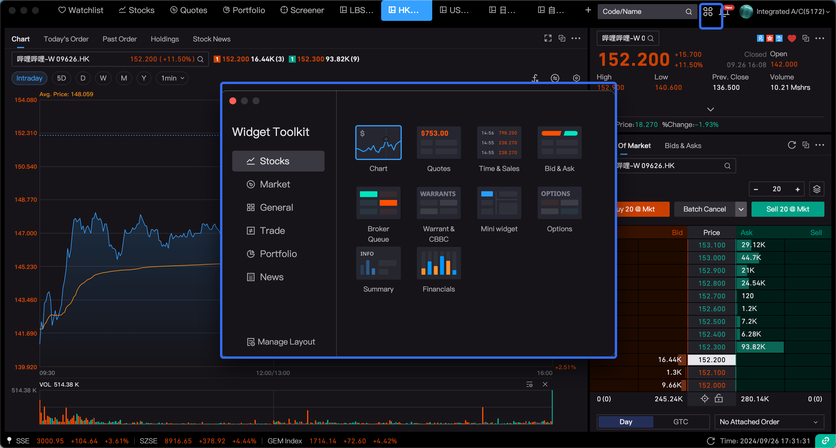
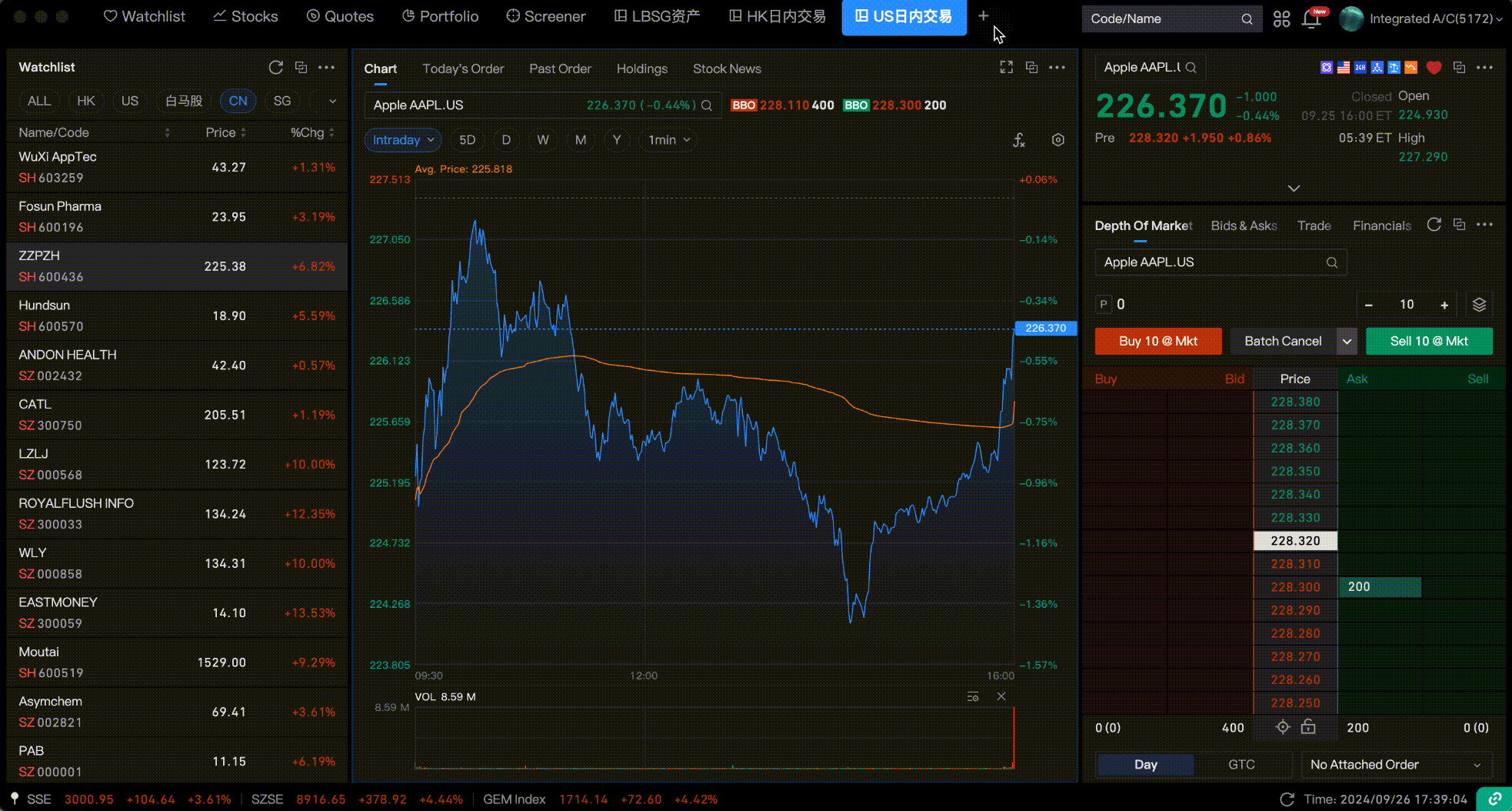
All functions on the Longbridge desktop are available in the form of components. You can view all the functions currently supported by Longbridge from the component toolbox in the upper right corner, including individual stocks, markets, general, trading, assets, and information categories.
2.Instructions for Individual Component Operations
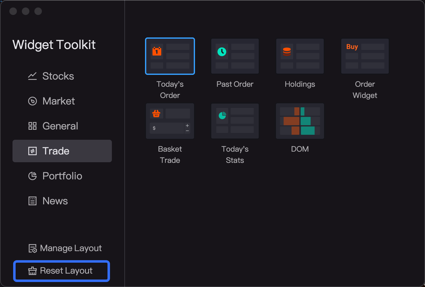
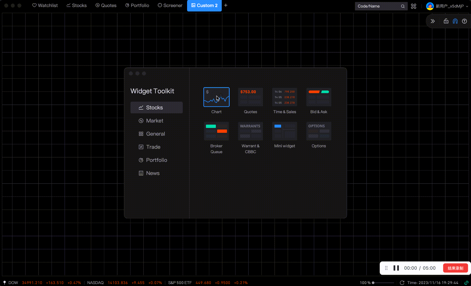
2.1 Adding Components
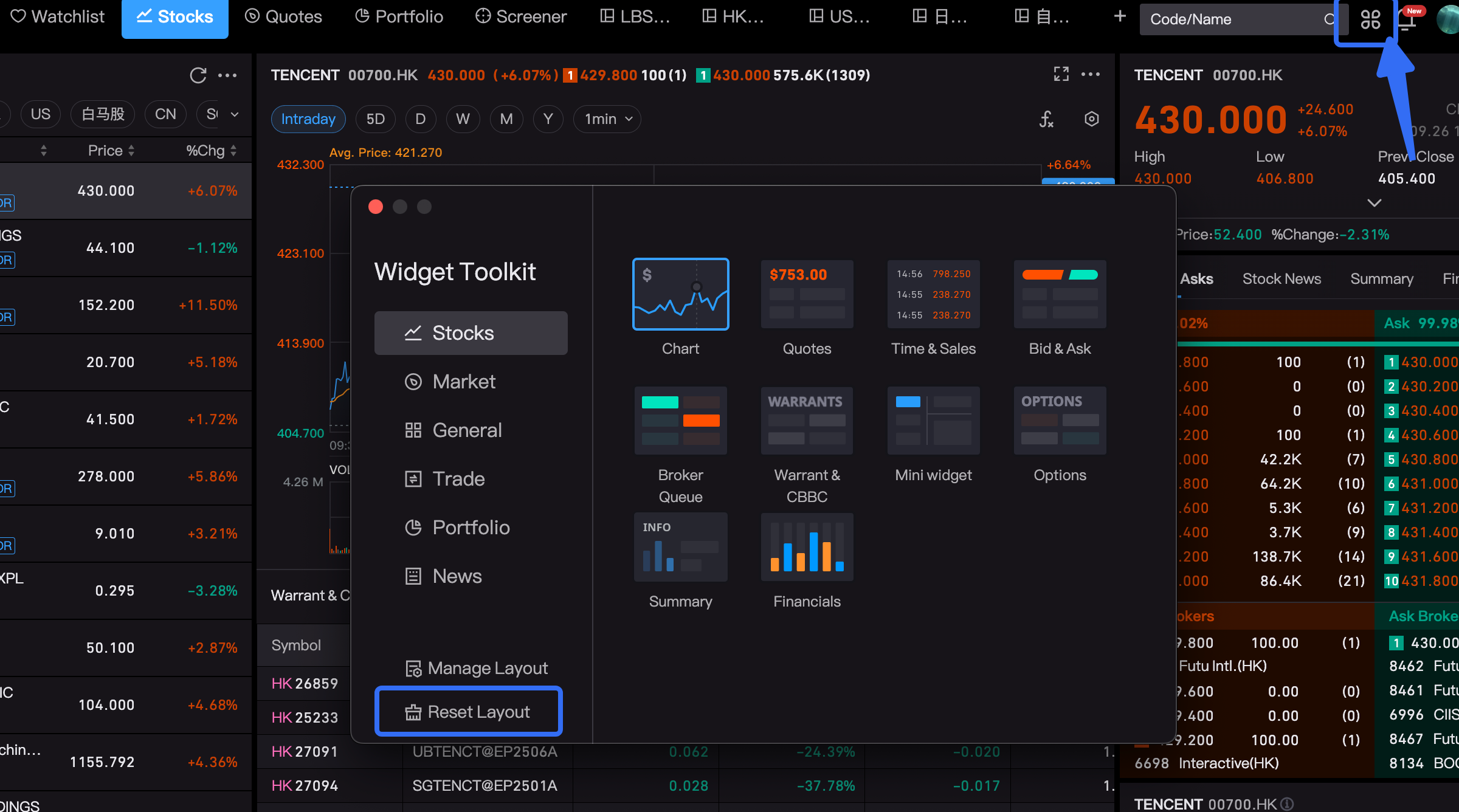
A toolbox entry has been added to the upper right corner of the desktop, which gathers all functional components. Users can click to add components and drag them into the current panel.
2.2 Component Size Can Be Freely Adjusted
The size of each component can be freely adjusted. You can drag and resize the components within the boundary of the component edges.
2.3 More Component Operations: Copy, Maximize, Detach, Remove
Click the "..." in the upper right corner of each component to access more operations.
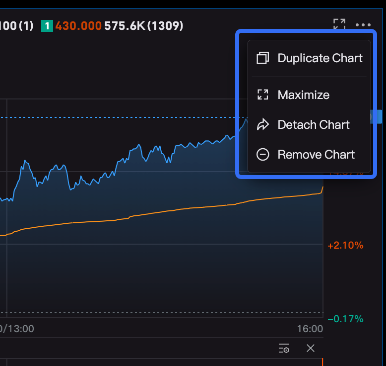
(1) Copy: This will copy the current component to create a new component, displayed in a detached window.
(2) Maximize: Clicking on the component will maximize it to fill the screen. Clicking the restore button in the upper right corner will automatically restore the component to its default size.
(3) Detach: Clicking detach allows the component to be separated from the current window into an independent component window. This is convenient for keeping a small view while using other software.
If a component is detached from the current panel or added to the current panel, the component window will display the source panel and will, by default, be linked with the source panel.

(4) Remove: Clicking remove will remove the current component. If it is a system component such as watchlist, stock, market, or trading panel, you can click 'Reset Layout' at the bottom of the component toolbox. Custom layouts are not allowed to be reset.
3.Component Linkage Instructions
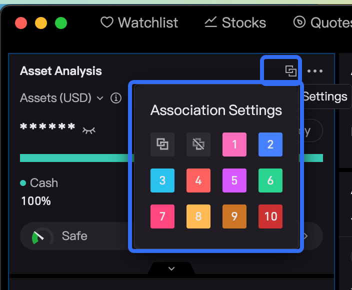
3.1 Custom Linkage Groups
Components in the system layout are linked by default, and currently, it does not support setting linkage groups.
For newly created custom layouts, components are not linked by default. Users need to decide whether to set linkage groups, which are divided into the following groups:
Default Linkage: All components are linked without setting a group.
No Linkage: Selected components and subjects are not linked.
Linkage Group 1, Linkage Group 2, ... Linkage Group 9: After clicking linkage, the component's upper right corner will indicate the current linkage group, and components in the same group will automatically link.
3.2 Linkage Parameters
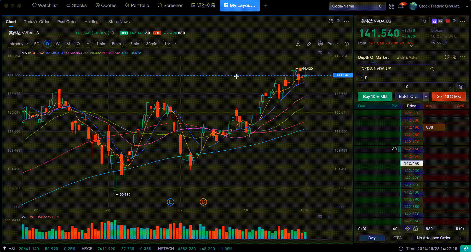
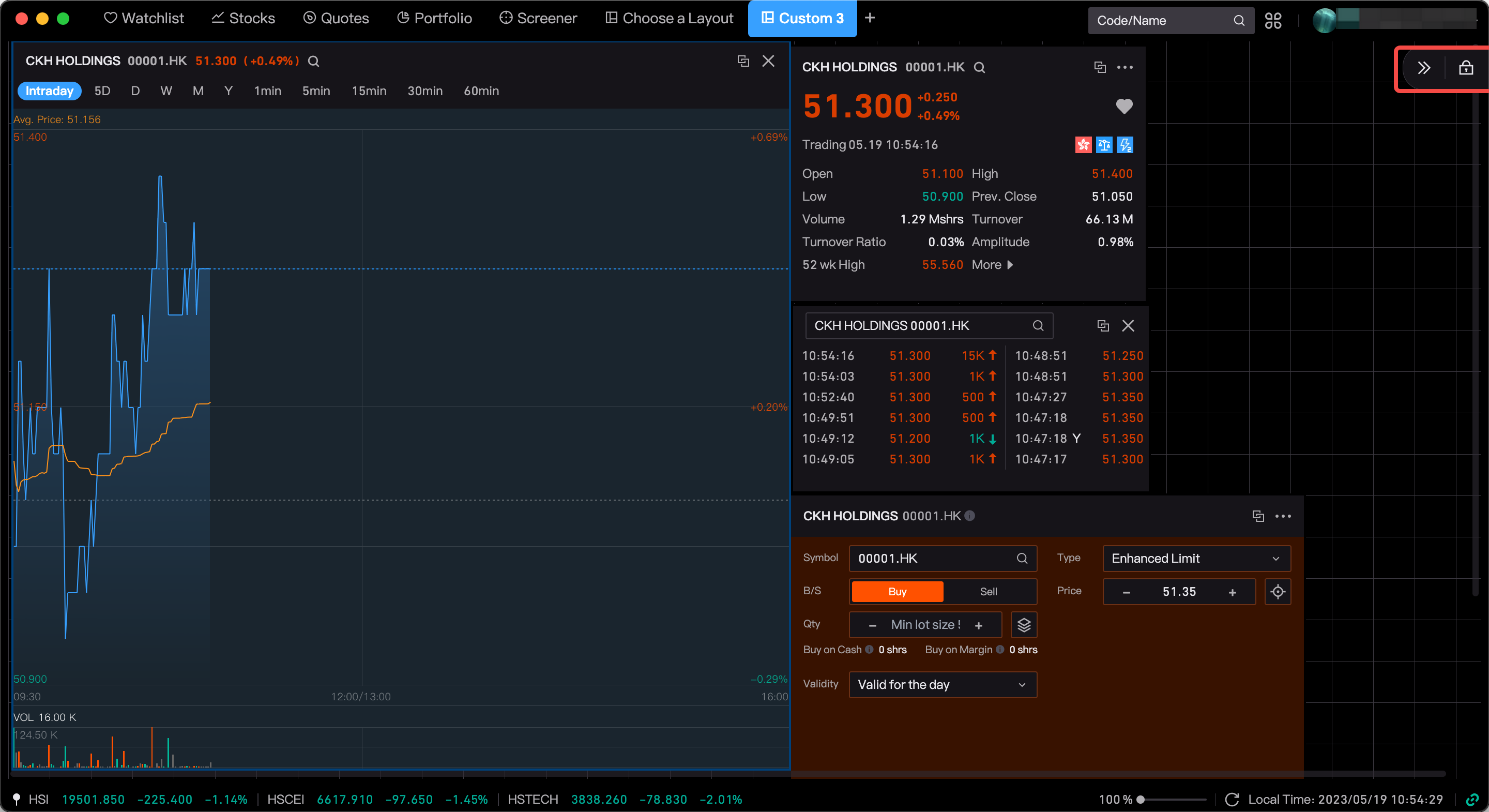
Stock Linkage: When the chart and trading components are set to linkage mode, switching the chart to Stock A will also switch the trading component to Stock A. Currently, most components support this stock linkage.
Market Linkage: The market for account assets and holdings is linked by default. For example, if the account assets switch to Hong Kong stocks, the holdings will also switch to Hong Kong stocks.
3.3 Unidirectional and Bidirectional Linkage
Bidirectional Linkage: Currently, all linkages are bidirectional. That is, clicking on Component A will cause Component B to follow, and vice versa.
Unidirectional Linkage: In unidirectional linkage, clicking on Component A will cause Component B to follow, but clicking on Component B will not cause Component A to follow. There are currently no business scenarios for this, but it may be gradually introduced in the future.
3.4 Source Panel Linkage
If a component is detached from the current panel or a new component is added to the current panel, the component window will display the current source panel. By default, the component will link with the source panel.
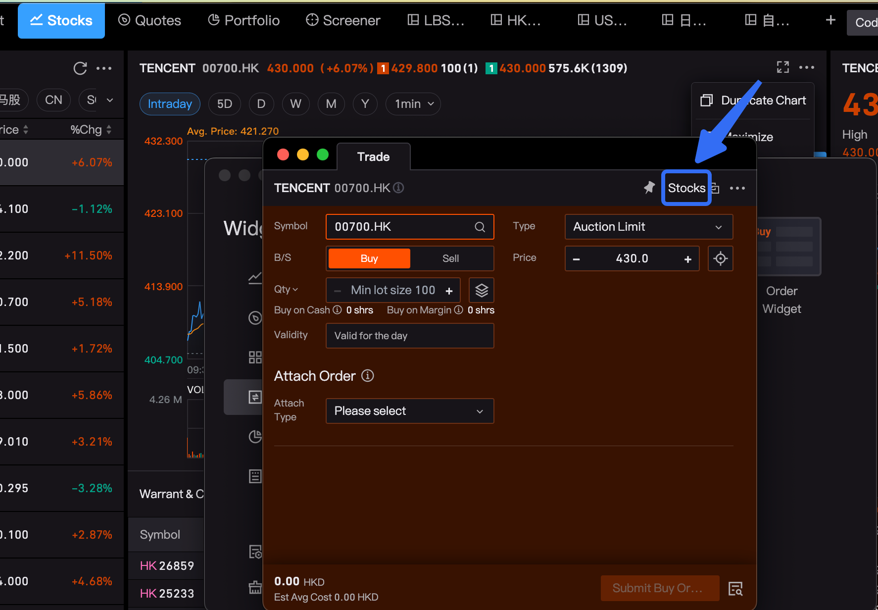
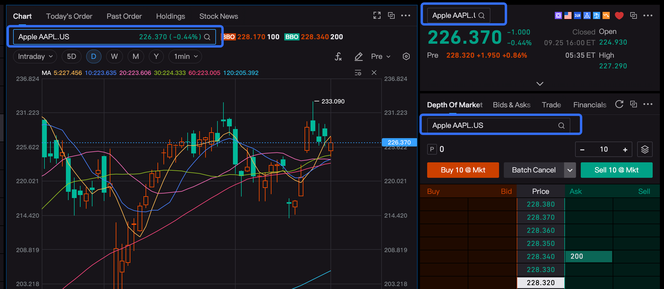
4.Component Header Search
The component header includes a search function, categorized as follows:
Some components have stock-related attributes, such as charts, quote information, and transaction details. When these components with stock-related attributes are detached, the component header automatically includes a stock search function, making it easy to switch stock targets.
Newly created custom pages with stock-related components have headers that automatically include a search function, making it easy to switch stock targets.
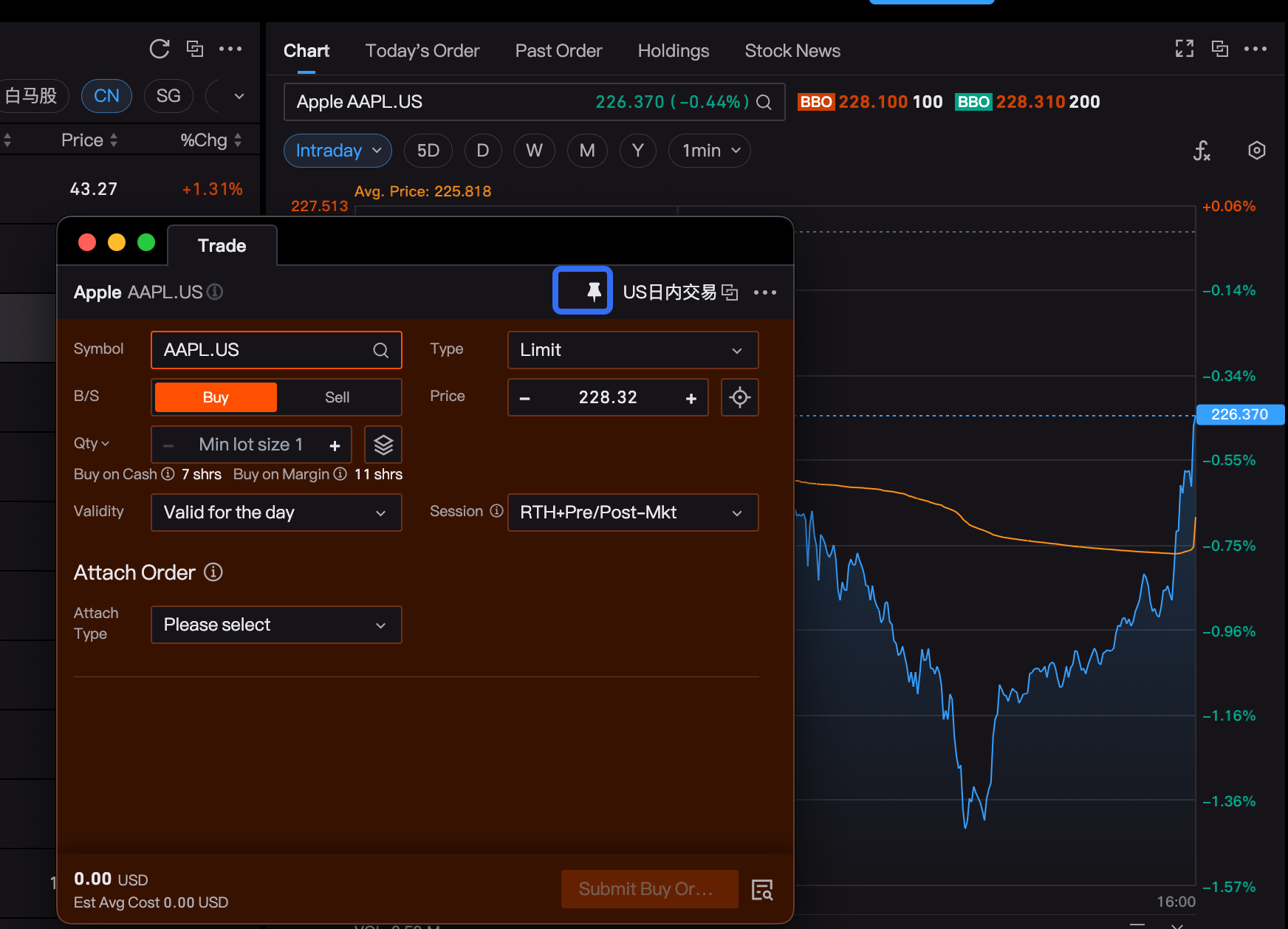
5.Component Pinning Operation
After a component is detached, clicking on other software or the main window can easily cover the current component. If you need the component to stay on top, you can click the pinning function in the upper right corner of the component to keep it floating on top.
To unpin the component, click the pinning button again to cancel the top-level positioning.
Layout Description
Currently, the desktop layout is mainly divided into two types:
System Layout: The default layout provided by the system, such as Watchlist, Individual Stocks, Market, Assets, and Stock Picker pages, is considered the system layout;
System layouts cannot be edited or deleted, but the content and layout of components within the panels can be customized.
Custom Layout: The layout after opening a new tab, which can be custom named, deleted, etc.;
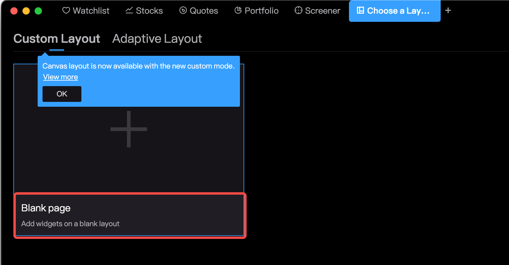
Custom layouts are further divided into two types: Adaptive Layout and Canvas Layout;
1.System Layout
1.1 Introduction to System Layout
The default layout provided by the system, such as Watchlist, Individual Stocks, Market, Assets, and Stock Picker pages, is considered the system layout; system layouts cannot be edited or deleted, but the content and layout of components within the panels can be customized.
1.2 Reset System Layout
For system layouts, if the user has modified the layout and wants to revert to the system default layout, they can click the component toolbox in the upper right corner to reset the layout and restore it to the system default layout.
2.Custom Layout
For newly opened tabs, they are all custom layouts. The specific operations are as follows:
(1) Click the "+" on the right side of the menu bar to open a new tab.
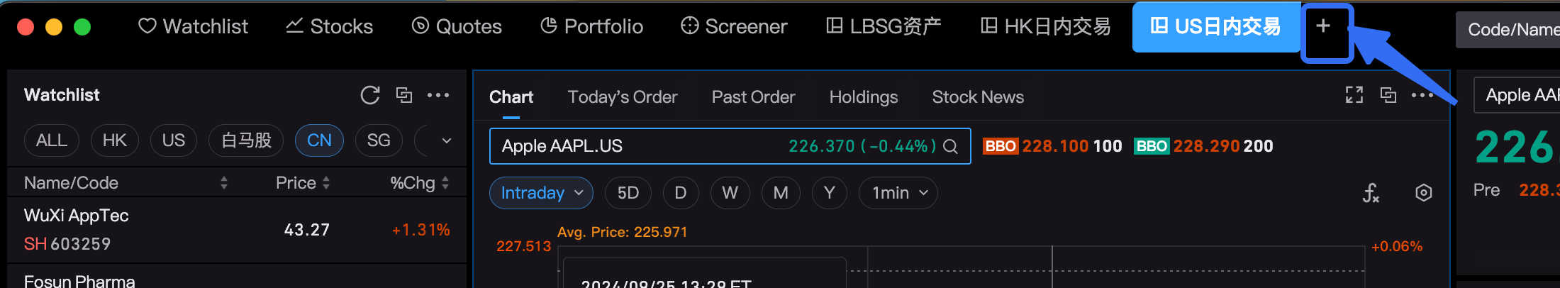
(2)Currently, custom layouts include two types: Adaptive Layout and Canvas Layout.
Users can choose according to their needs. The introduction and differences between Adaptive Layout and Canvas Layout are detailed below.

3.Custom Layout - Adaptive Layout
3.1 Features of Adaptive Layout
Adjusts the layout size according to the screen size
If there is only one component in the layout, it will occupy the entire screen
When resizing one component, it will automatically adjust the size of other components to fit
3.2 Operating Instructions
(1) Open a new tab and select Adaptive Layout
(2) The system currently provides various trader templates for adaptive layouts, such as securities trading, day trading, multi-stock layout, etc., which can be used directly or created from scratch.
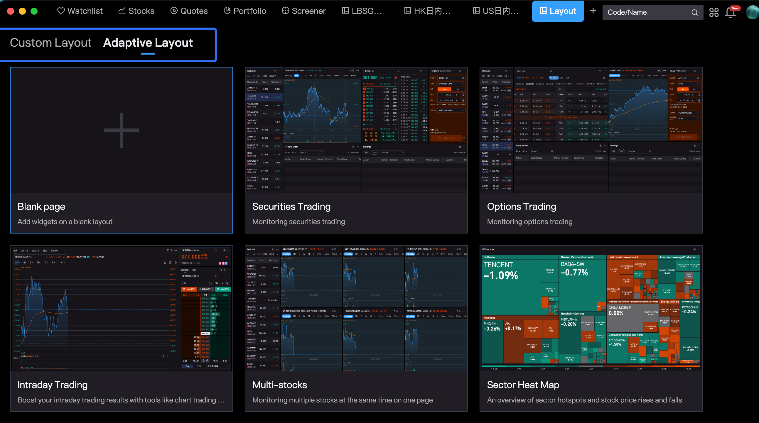
(3) Click on the blank layout to directly drag components from the component toolbox into the panel for layout.
(4) You can also combine various functions mentioned earlier, such as component operations, component linkage, component header search, and component pinning, to perform various joint operations based on your needs.
4、Custom Layout - Canvas Layout
4.1 Features of Canvas Layout
The canvas size is not limited by the screen; if components exceed the current screen size, you can scroll the canvas up, down, left, and right.
If there is only one component in the layout, it will still display the current component size by default and will not occupy the entire screen.
When resizing one component, the current component will not squeeze the size of other components, and components can overlap each other.
4.2 Operating Instructions
Enter the Canvas Layout, and you can directly drag components from the component toolbox into the canvas layout; you can also summon independent component windows and drag them directly into the canvas layout panel.
You can click the "X" in the upper right corner of the component to close the component; or click the "..." in the upper right corner of the component and select "Remove Component" to close the component.
4.3 Locking Function
After editing the canvas layout, you can click the toolbar in the upper right corner to lock the page layout. Once the page is locked, you can no longer add or move components, which helps prevent accidental layout changes by the user.
After the page layout is locked, you can also click to unlock the page to remove the layout lock.
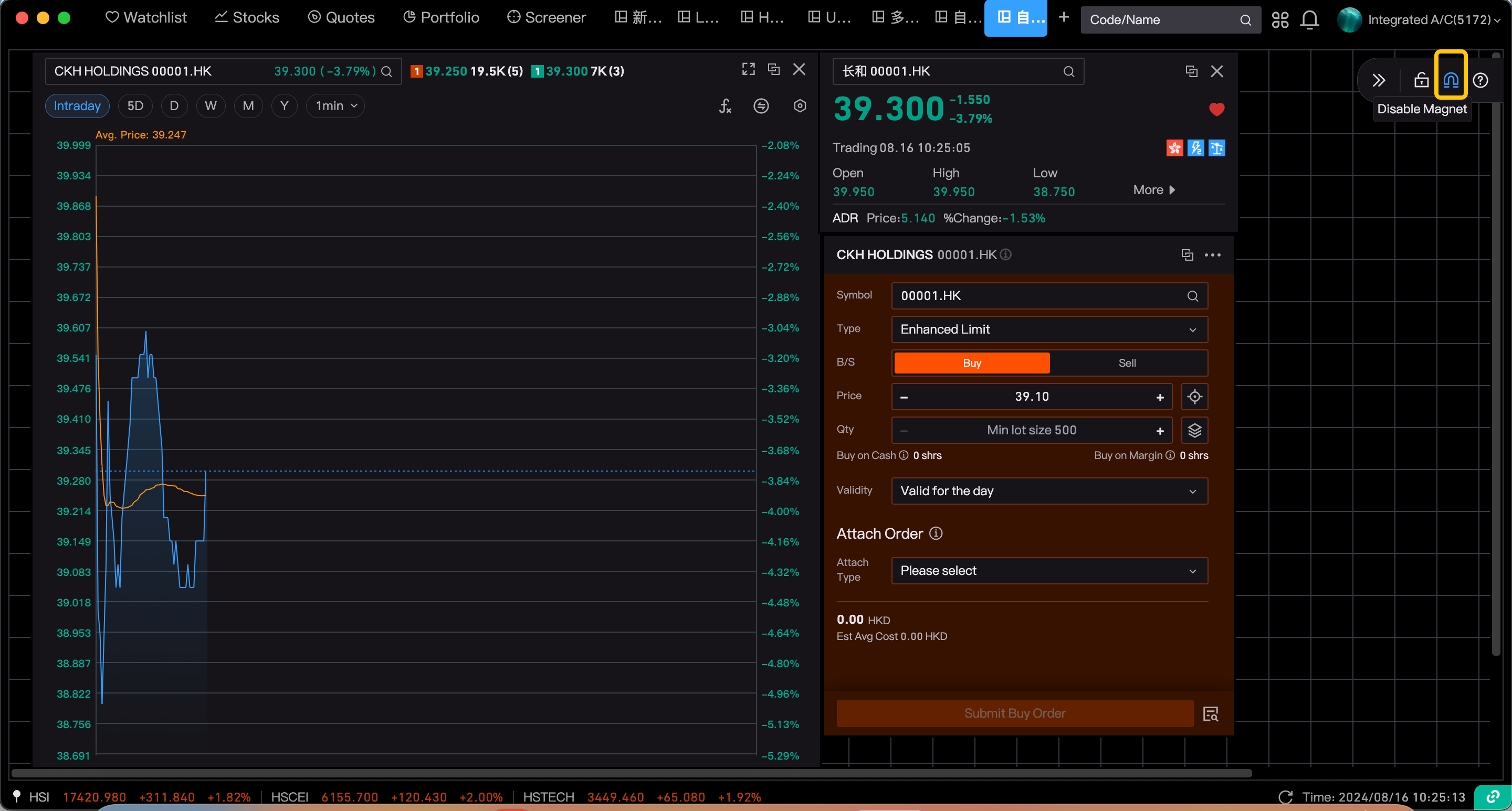
4.4 Snapping Function
The snapping function is a design tool aimed at helping users align and arrange elements on the canvas more easily. When users move elements on the canvas, the snapping function automatically snaps the elements to the nearest grid lines or other elements, achieving precise alignment. This not only improves design efficiency but also ensures neat and aesthetically pleasing layouts.
In the canvas layout, the snapping function is enabled by default. If not needed, it can be turned off by clicking.
5、Comparison of Responsive Layout and Canvas Layout
Responsive layout and canvas layout each have their own advantages, disadvantages, and suitable scenarios. Users can choose which layout method to use based on their needs.
| Layout | Canvas Layout | Adaptive Layout |
| Layout Features |
|
|
| Functional Scope |
| New Tab Page - Custom Layout; |
| Whether the Size Screen Fits |
|
|
| Whether components can be overlapped? |
|
|
| Benefits |
|
|
| Shortcoming | Limited by the size of the screen, when multiple large components are put together, they will be squeezed smaller, which will affect the use of component functions. | Lack of Flexibility: May require separate designs for different devices. User Experience: May not provide a consistent user experience across different devices, especially on small screen devices. |
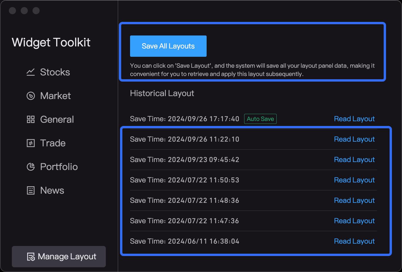
6.Layout Management
All layout information customized by users is currently automatically stored in the cloud by the system. If there is a layout loss, users can click on the component toolbox in the upper right corner and select "Layout Management" to retrieve their historical layout data.
6.1 Automatic Save by the System
For layout modification operations performed by users, the system will automatically save the latest data. If there is data loss, it can be recovered by reading the system archives;
Currently, the first piece of data by default is the system automatically saves data;
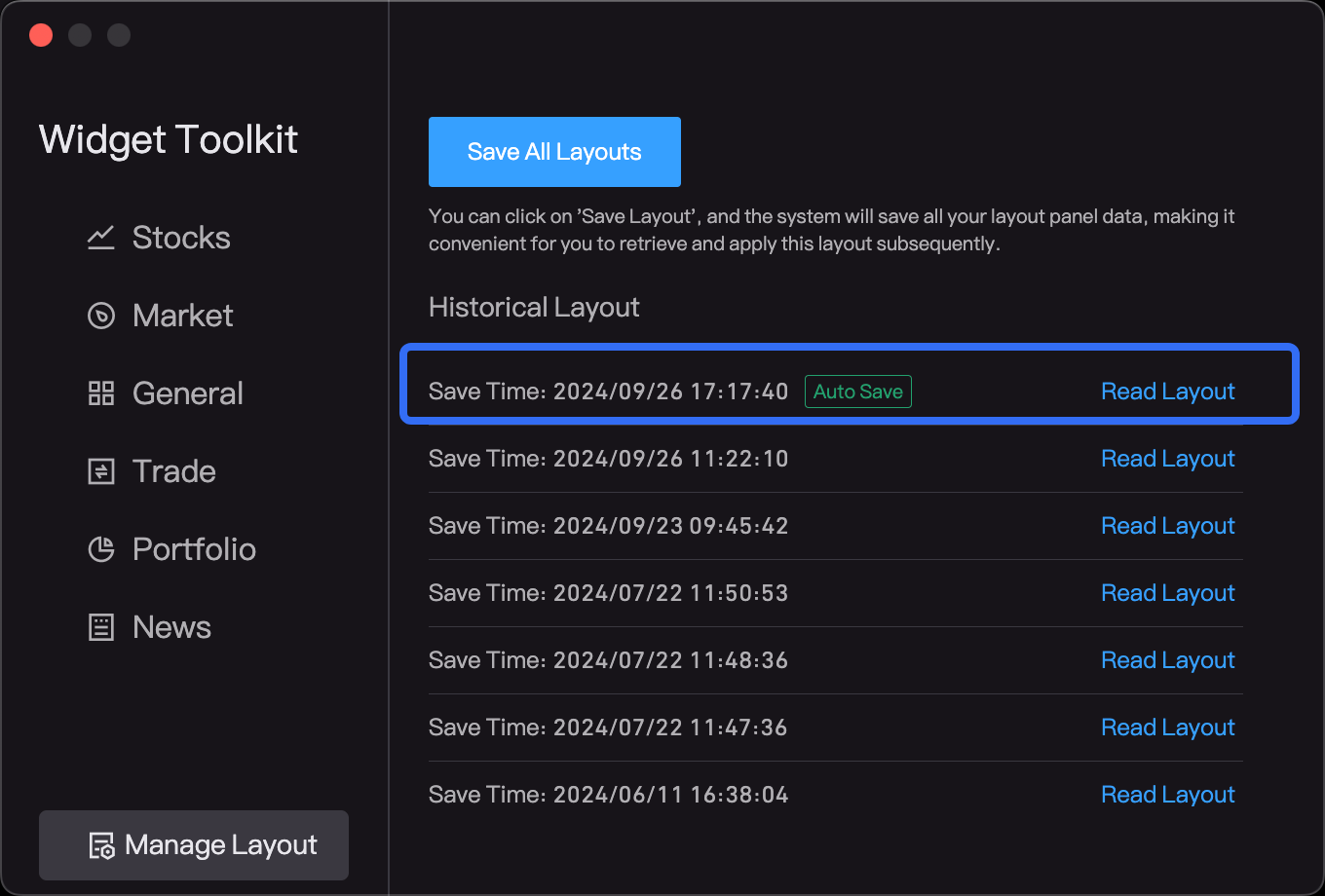
6.2 Manual Save by Users
However, if users want to find more historical layout data, it is recommended that they manually click "Save All Layouts". Users can then retrieve historical layout data as needed. Currently, manual saving supports up to 20 pieces of data.
7.New Tab Supports Save as My Layout
In a newly opened tab, you can right-click on the menu and select "Save as My Layout." Once saved, you can quickly open it from the layout selection under "My Layouts" for convenient repeated use in the future.